Friday, August 29, 2014

Stamp Block Backgrounds


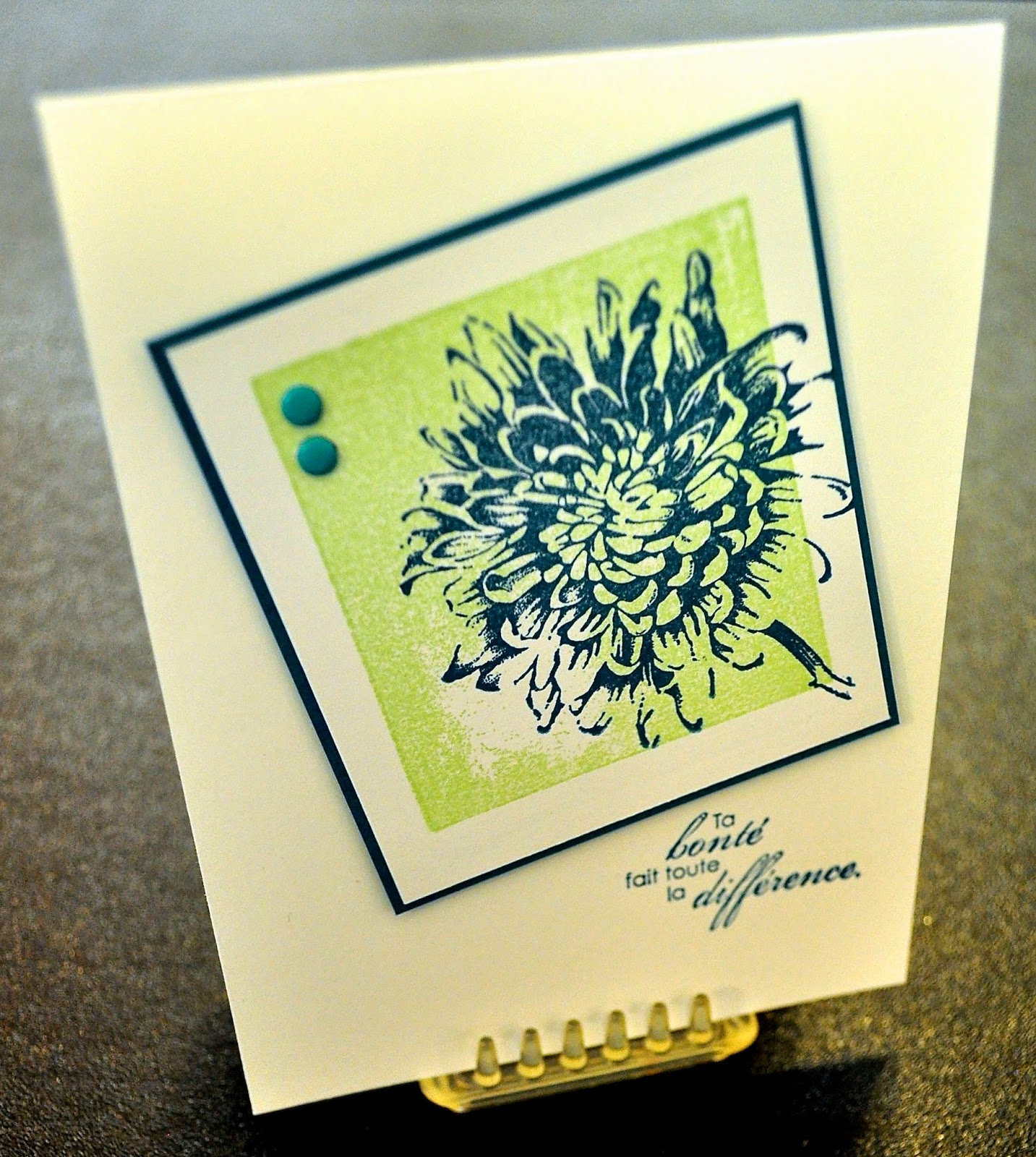
In my last post, I talked about backgrounds to help ground an image or to add color. One of the simplest ways to do this is to use your clear stamp blocks! You want a block that is just slightly smaller than the image you want to use, so that the image overhangs just a bit. This adds interest and importance to the image. Be sure your block is clean - alcohol will take care of fingerprints, but if you've gotten some adhesive on it (it happens, who knows how?!) try lighter fluid for easy removal.

Tap the clean block several times on your ink pad (in this case, Pistachio Pudding). The texture will look like tiny dots, due to the fact that the ink beads up on the acrylic. Stamp down on your paper as you would normally. Ta da! Nice clean edges and a block of color. If your block is large, you may need to put a silicone pad or something a little "squishy" beneath your paper before you stamp to prevent "whiteout" spots, although you may decide (as I did in the sample) that you like a point of light in your background. Clean as usual on the Stampin' Scrub.


Blooming with Kindness has loads of useful sentiments (in French or English!) and a very graphic flower, which translates well for this technique. Ink up the flower in Island Indigo, and angle it so that it overhangs your color block in a couple of places. Back with a very narrow margin of Island Indigo cardstock and add a couple of coordinating Candy Dots.


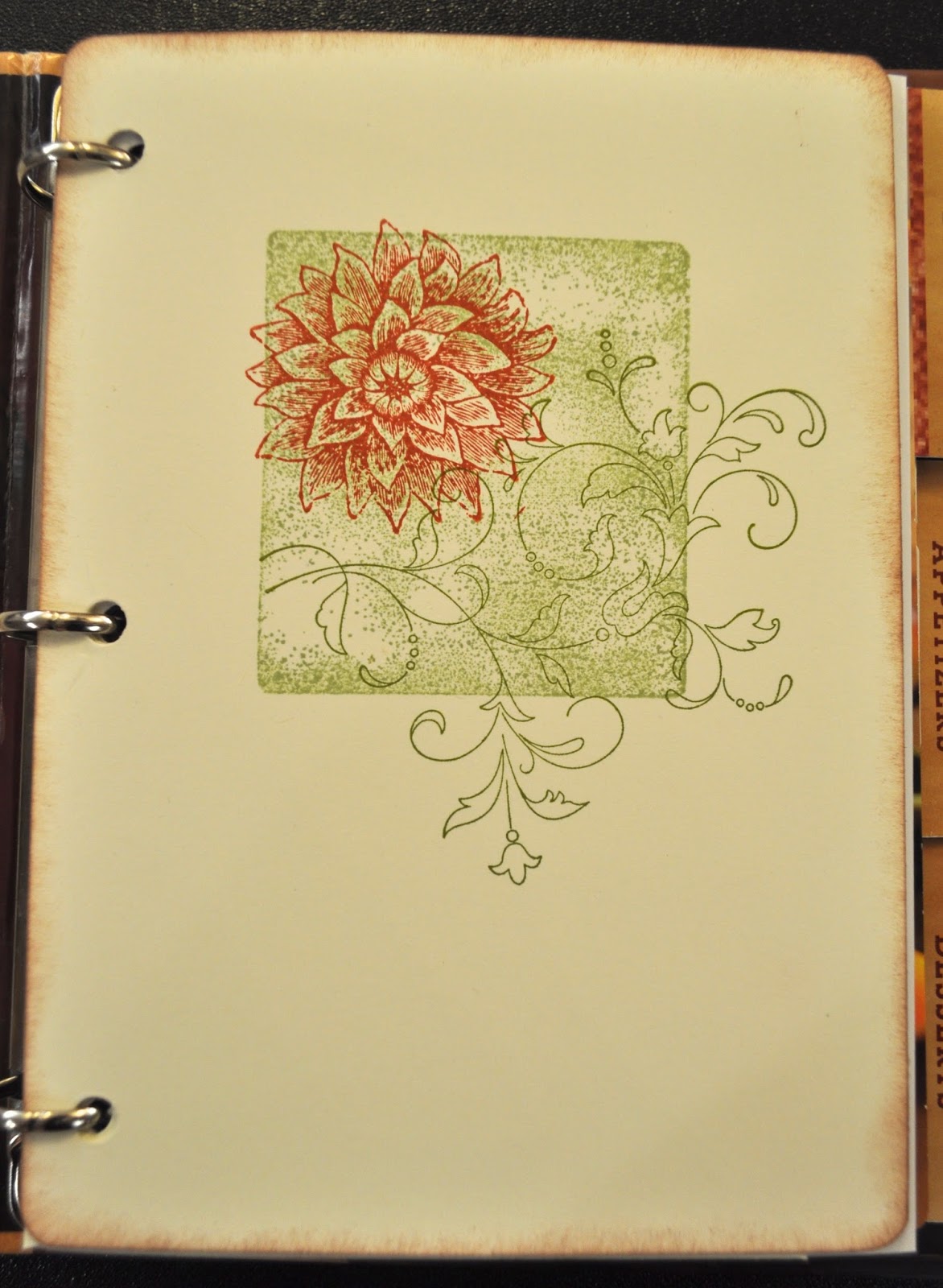
Inside, you'll see that I've reversed colors and used the flower in Pistachio Pudding for some background interest. I inked once, and stamped three times. The fainter the image becomes, the more your eye reads it as texture, rather than as image. I've repeated the sentiment from the front of the card in its English translation on the inside of card the front, and completed the thought with an additional sentiment in English. I'm a strong believer that we need to learn and appreciate other languages and cultures in this interconnected world.

Kathy


Wednesday, August 27, 2014

Work of Art meets Everything Eleanor


Have you ever tried to make something look effortless?! It's not as easy as it sounds, and that's exactly why Work of Art has become an instant favorite of mine. Watercoloring is such a wonderful look, but I've never been a watercolorist. Until now.

With this stamp set, you can make a background that anchors or adds color to just about anything else you want to put on the page. And what a great message to send those we love or wish to encourage: You are a fabulous work of art.

To replicate this card, you'll need Bermuda Bay, Hello Honey, and StazOn black inks (Hint: The small watercolor stamp is inked only once but stamped three times, from bottom to top). The swirl is from Everything Eleanor. A scrap of Bermuda Bay CS and the Elegant Butterfly punch add the third dimension, with a row of Basic Rhinestones for the body. Corners were rounded with the Project Life Corner Punch (p. 188). Pop up your "art piece" with dimensionals, and you're done! Another superspeedy layout for a card that fits so many occasions.

Kathy

Note: We made this in a demonstrator group meeting, but I believe the original concept came from SU! demo Sandi MacIver.


Monday, August 25, 2014

Silver Shimmer


Today's post is for all you "bling" lovers out there. Dawn Olchefske was inspired by a piece of jewelry to create this elegant card with the Petite Petals, Pansy, and Itty Bitty Accents punches. Of course, the gorgeous Million & One sentiment set (stamped here in Basic Gray) is a perfect match to the Silver Glimmer, Silver Foil and Whisper White papers.


The only other thing you need for this card is a whole bunch of Stampin Dimensionals and some Basic Pearls and Rhinestones.

Isn't "Clean & Simple" wonderful?!

Kathy


Friday, August 22, 2014

Bleached Summer Silhouettes


I think I've pinned about a hundred samples made with Summer Silhouettes. This is a good indication that a set is versatile, easy to use, and... I need it! At any rate, I believe that the inspiration for this particular card was first noted on the blog of SU! Demo Lisa Young.

For this card, I've used Soft Suede ink and paper, as well as Pool Party paper. Petite Pairs provides the sentiment. The half flower on the banner is hand cut, popped up on dimensionals, and accented with the tiniest pearl.


I kept the inside very simple.


How do you stamp with bleach? Easy-peasy:

1. Make a "stamp pad" by folding a paper towel into quarters. Place it on a disposable plastic plate. Pour on enough bleach (some people recommend the thicker "splashless" variety but I don't think there's that much difference) until the paper towel sounds "squishy" but no bleach runs when you tip the plate. Note: Best results are obtained when using fresh bleach. I also recommend taking the time to change into old clothes!

2. Press your stamp into the bleach pad several times until it seems to be evenly coated, then stamp onto colored card stock. You'll need to wait several moments to see the magic happen! It's a good idea to make test samples on several different colors, as the specific composition of the dye used on the card stock may not be what you expect! Rust and Olive bleach to yellow, Navy to light blue, etc. BUT you also need to be aware that different dye lots of the same color may perform differently!

It makes sense to do several bleached projects at once while you're being all messy and experimental. When you are done bleaching, IMMEDIATELY clear your bleach-soaked pad off your work area to avoid heartbreak. Don't ask.

3. Bleached card stock must be completely dry before you add ink (if it isn't, your ink will just bleach out). So now is the time to safeguard your rubber. Wash stamps with a mild soap such as Ivory dishwashing liquid to neutralize the bleaching action, and pat dry or leave to air dry. Before you put them away or use them again, spritz on a light coat of Stampin' Mist and allow to sit for a moment, then brush across Stampin' Scrub to remove excess. This will prevent your rubber from hardening.

4. Once bleached card stock is dry, overstamp with coordinating images. This juxtaposition of detail in the stamped images and the soft look of the bleached images will give you a foreground/back-ground effect that creates a subtle dimensional effect on your card.

Watch for more samples made with the Summer Silhouettes stamp set, as I put together my own "Set Sampler" from my Pinterest pin collection (to see them all together, go to the labels column on the right and click on "Set Sampler - Summer Silhouettes).

Kathy


Wednesday, August 20, 2014

Just Sayin': Love ya!


I swapped with Monique for this card recently. What a fabulous way to use a sentiment set as the "art" on a card! And keeping it simple in black and white with a pop of red glimmer paper draws your eye right where you want it. We've got white StazOn, or you could emboss in white on black. The wee heart comes from the Owl Builder punch.

Kathy

Monday, June 2, 2014

Play Date: World of Dreams


I love putting grown-up play dates into my calendar! We all need those to relax, be creative, enjoy the company of friends... and sometimes they can even motivate us to get something done that we've meant to do for ourselves, but just haven't made a priority. When I recently got together with Deloris, a favorite play date partner, she asked if I'd design something for us to do together with one of my very favorite new stamp sets in the catalog, World of Dreams. I had recently become intrigued with the combination of Pistachio Pudding and Garden Green, so I decided to incorporate those colors. I'm also a fan of the "Clean & Simple" look, which often utilizes white on white (casting a shadow for additional interest) and black ink for a sharp contrast with a bright color. I decided to vary the formula by substituting Early Espresso for the black.


I stamped the Early Espresso images on scraps of Whisper White, then centered my 1 3/8" square punch over the part I wanted (if you didn't get that punch before it retired, just cut a strip of white that is 1 3/8" wide and center the image, then use your paper trimmer to cut the other two sides of your square). The second layer is 1 1/2", both popped up on dimensionals. By cutting your paper smaller than your stamped image, you make it run off the edges, giving the illusion that you're "zooming in" to see the details, much like the paintings of Georgia O'Keefe.

I hope you're inspired to schedule a play date with a friend, because creating - in some form or other - is a basic human need. If you each come up with a project or two to share, you'll have twice the fun and lots to show for your efforts!  

Kathy

Friday, May 30, 2014

Friendship Squares


 We've seen a number of posts recently featuring these little squares, much like what are called "Artist Trading Cards" (ATCs). I was thinking that when each person makes a set so that everyone gets one, they are like the friendship quilts my grandmother used to make, so I decided to call them "Friendship Squares". These measure 2.75" square, and are easily coordinated by selecting a series of Designer Series Paper (DSP) and a theme such as flowers, a season, a holiday, etc. Our demonstrator group decided to do a swap in May, and I've grouped some of the delightful designs above to illustrate how you might use them for a piece of home decor in a 12x12 frame (blanks could be filled in with additional designs or with a printed label such as "SU! Demos, Summertime, May 2014").

But what else could you do with them, I wondered? How about some cards? How about a simple approach that could be used with any set of colors or content??!

I came up with a set of quick and easy layouts for the squares using the coordinating colors specified by the DSP. Basically, you add a square from your stash and a sentiment that matches the occasion for which you need a card!

Here I've simply added a 3x4" base for the friendship square created with the Petite Petals punch and Secret Garden framelits.

In this example (folded from the hexagon punch), I grounded the Friendship Square with 2 punched squares for a little extra weight and pizzaz.      


Aren't these duckies delightful? You'll find them in the Baby's First framelits. I saw somewhere out in the wide world of the internet the idea of putting a Sharpie dot on one of our halfback pearls to make bulging eyes. The "waves" are popped up on dimensionals.

A simple notch with a square punch makes this paper ribbon strip, and a variety of flower punches from scraps balance the stamped nest from World of Dreams. Tiny pearls and a candy dot add extra dimension. In this case the art piece is up on dimensionals so that it casts a shadow.

This little fellow is a real hoot, isn't he? The creation of Monique, I simply centered him and added a big block sentiment from Bravo.

Using just a small portion of a larger stamp (in this case Postage Due) is a great way to find "new" images. I used the Perfect Pennants framelits to make my "racing flags", and Petite Pairs for the set of sentiments inside and out.

I forsee several versions of Friendship Squares in my future, made from different DSP with different themes. To find them all, click on the label "Friendship Squares" at the bottom of this post or in the sidebar.

Better yet, try your hand at it and leave a link in the comments section!

Kathy
Thursday, October 31, 2013

Jump-the-Pumpkin Lantern


So my sister and I were wandering the "nobody-loves-me aisles" at Victorian Trading Company on a little day trip in August. I am not a person who tends to decorate for Halloween, but I fell for this little fella playing "jump-the-pumpkin"!

 It was marked waaaay down, due to a broken moon (and, I later discovered, right ankle). What to do?


I thought about the new air-dry clay in the Stampin' Up! catalog. Could I create an external reinforcement or framework with the clay? I decided to try.


After using re-inker to tint my clay (I matched a green bracelet worn by my clown), I chose my favorite leaf shape (more ivy than pumpkin!) and pulled and patted to form the lobes. The point of my dry embossing tool worked pretty well to incise veins. Carefully, I wrapped it around the broken horn of the moon, repeating the process several times until all cracks and missing chunks were covered.


I also discovered that I could make a very creditable "vine curl" by rolling a thin "worm" of clay and just letting it curve and loop naturally. This was a great way to cover some hairline cracks without over-doing the leaves. I added curvature and dimension to the leaves and curls as I gently pressed them in place.

I worked my way from the front, around the side, to the back. I allowed all the leaves to dry in place for 24-48 hours.

I matched some blue clay to another bracelet to add a cuff above the broken ankle.

Once they were dry, I carefully peeled up just enough of the leaf to
apply a generous amount of Tombow Multipurpose Glue. The
glue dries clear and forms a permanent bond between the clay
and the ceramic lamp's surface.


I wish my photography skills were up to showing you how fine it looked lighting a dark corner near the bathtub (our Halloween grotto was once again in the bathroom!).

As I was working on the pumpkin jumper, I noticed that his tunic sported a row of little paper pom-poms down the front. They made me think of our creped filter paper, so I made a larger size and incorporated that on my cookie cylinder (a repurposed Piroulini can), as you see here.

I had designed some Halloween tags in My Digital Studio way back in July, so I had those on hand, and I added a rosette made with our Designer Rosette Bigz die and another aged paper clay button. You will also notice strips of trim from the Tasteful Trim Bigz die and one made with a retired border punch. The paper is all held to the can with Sticky Strip, which I love because it provides instant adhesion! A little squirt of Log Cabin spritzer gives the pom pom some textural interest.

I hope this project has inspired you to restore something broken and useless to a place of honor in your own life.

At any rate, Happy Halloween, friends! May you enjoy something quirky and unexpected on this day of disguises and may your treat bags be filled with good things.

-Kathy


Monday, September 23, 2013

Stamp Club DBS: August 2013

The August hostess for the Dead Birds Society chose to replicate a package wrap from page 15 of the current Idea Book & Catalog. What a smorgasbord of products to play with! We began by popping up one of SU's little kraft gift boxes, then placing a bellyband of DSP around it (this makes the whole decorative unit slide off - and back on again for repeated uses!).


We adhered some lace tape to the sides so it would just peep out from under the ribbon, then tied on seam binding tape. Next, we folded and cut some pieces of creped filter paper for a ruffle, topped by a doily. Holes punched through each of these enabled us to thread them onto the seam binding ribbon.


More DSP was cut and scored with the Designer Rosette Bigz XL Die to make - you'll never guess - a rosette. We scrunched and peeled some punched scallop circles, and finally tied on more seam binding tape atop the whole thing. Whew! Lots of steps, but each could be used alone or in combination with just a couple of others, so we learned a great deal.


Finally, to construct the tag, we heat embossed the "Happy Birthday" from You're Amazing twice and popped up the "Birthday" line as a banner on dimensionals, accented with Pumpkin Pie die cut strips. A couple of Pumpkin Pie candy dots and then it was ready to tie on with linen thread.

The recipient of this package will know themselves to be very, very special indeed.  -Kathy

Wednesday, September 18, 2013

Stamp Club DBS: Welcome to Idyllwilde Studios


I'd like to introduce you to my newest group of stampers, The Dead Birds Society. Yes, a slightly crazy name, but it suits these slightly crazy gals who love to laugh. These gals have been friends for years - it was very kind of them to let me in on the fun! The story goes that after a late night at a scrapbooking retreat in Oklahoma, someone commented "Deb's an early bird!" the next morning but the comment was misunderheard as "dead birds"! This incident recalls their good times together in a nutshell, so they elected to call themselves the Dead Birds Society (and if you've never seen The Dead Poets' Society - note the similarity?! - may I recommend it to you as a most thought-provoking movie and well worth the time you'll spend).

Our first project as an official club was this card using Regarding Dahlias. We stamped three flowers, and cut away differing amounts of petals, using shaded edges and dimensionals to pop up the layers for depth. The background curlicues are borrowed from Everything Eleanor.


Inside, the sentiment is from Feel Goods, which just may be my favorite sentiment set in the 2013-14 catalog.


It's super easy to switch out your sentiment in either or both places to adapt the card to multiple uses.


Check back often to see what else these gals get up to. I'm sure you won't be disappointed!  -Kathy

Monday, September 16, 2013

Stamp Club Olathe: September 2013


Re-Purposed Menu Binders

One of my customers likes to bring me things just to see if I can recycle them into something new. (Stay tuned, Lorena, there's another of your inspirations coming in the Christmas collection!) Her daughter was working at a restaurant when the company decided to update the menus, so I was issued the challenge: What could we make of these little 3-ring binders?


As you can see, there are a variety of page sizes, some tabs, plus inside and outside covers to consider. Since it's autumn and the tones of the menu are the colors of rich spices, I chose a palette of Very Vanilla, So Saffron, Cajun Craze, Old Olive, and Early Espresso. For the cover, I wanted to try out the watercolor technique using clear blocks shown here. We used the World Map stamp and glued the panel to the cover with the amazing Tombow Multipurpose Liquid Glue, smoothing from center to edges with the edge of a bone folder. Each person's cover came out beautifully different, but here's what mine looked like:


By selecting a color palette that echoed that of the original, I didn't feel that I had to wrap my new cover around edges and corners. Just covering the images seems to be enough.


Here's the inside front cover (the inside back will be similar, but likely with a pocket adhered at the bottom). I stamped this in Rose Red as an experiment... but by the next page I had changed to Cajun Craze, which tones much better with the original colors peeping out at the margins! Creative Elements comes together so nicely over an "anchor" of Old Olive stamped with a clear block. I chose a sentiment from Feel Goods, thinking it would be a great reminder no matter how one chose to use the book.


Divider pages are done simply, as above, with three quick stamps requiring no careful placement.


Pockets are easily added by simply punching holes in an envelope and inserting as needed.

Now, what could this project be used for?? Our list of ideas included...
     *heritage recipes
     *babysitter or housesitter notes
     *holiday planning (including names/addresses for mailing cards, shopping lists, and recipes)
     *a gratitude journal
     *advices pages from each attendee at a bridal or baby shower
     *collected wise words to live by/favorite sayings
     *art or idea journal
     *home dec records (paint chips, fabric swatches, etc. for each room in the house)
     *photo/prayer journal for each family member as a gift for an elderly friend/relative, especially someone in the early stages of Alzheimers

Hope this inspires you to repurpose something you might otherwise send to the landfill. It's a great way to keep that brain in "innovation gear"!  -Kathy

Wednesday, September 11, 2013

Stamp Club Lawrence: September 2013


 The hostess for September chose to work with the air dry clay available in the new Stampin' Up! Idea Book & Catalog. This product offers a fabulous way to make embellishments, ornaments, and so much more... I'll be posting several project ideas using this product, so stay tuned! (You can find them all by clicking on the label "Products- Air Dry Clay").


For this polka-spotted card, I tinted the clay with just a couple of drops of re-inker to make the white clay more like our vanilla. Before pressing the clay into the molds, I dry-brushed a little Dazzling Diamonds onto the silicone mold. Once dry, a drop or two of Tombow Multi-Purpose Glue holds the flower in place - and it cost just pennies to make!


Don't you like the perky paper bow? That's done with an oval punch! I really like the Modern Medley Designer Series Paper. The black-and-white patterns mix and match with just about everything. The stamp set is Gifts of Kindness - it has the prettiest little font style!

Kathy

Monday, September 9, 2013

Little & Cute


I decided to make a little something for my stamp club ladies to show them how much I appreciate them. I was cleaning and sorting here and there, and came across this faux alligator paper (originally used to cover photo albums) that I bought at the Hallmark outlet store in Indian Springs shopping center (Kansas City). Of course that was a sign that I had to make purses on the Big Shot!

I decided to play with the new air dry clay. As you can see, I tinted some pink, some blue, and some green. I learned that Dazzling Diamonds glitter is a fabulous "mold release" plus it adds just a little sparkly bling to the flowers. It's nice that the silicone molds have three size options so you can scale your flowers to your project!

I just couldn't resist showing you...they look so business-like all lined up there on the table.

Kathy

Friday, September 6, 2013

Studio Open House October 5


Plan now to attend the
Idyllwilde Studios
Holiday Open House


Saturday, October 5, 2013
Drop-in event, 10:00am-2:00pm
1012 Pennsylvania, Lawrence, KS

*Try the new rotary attachments for the paper trimmer
*Create with air-dry clay   *See My Digital Studio in action!

Free Samples     Yummy Snacks     Discounted Stamp Sets 
Ideas to Jump-Start Your Holidays!     Hourly Prize Drawings
(bring a friend new to stamping or place an order
to earn extra tickets for the drawing!)

Rubber Renovations


There's nothing like a "reverse" stamp with a solid background to give your project a solid POP of color, right?! But what if you can't get that background to stamp well? What if you're getting "whiteout" in certain areas? This often happens with oversize stamps, particularly the wood-mounted variety, due to block warp, uneven inking, or pressure applied as you stamp down. If this is the case, try:
  • Ink the stamp again, holding it rubber side up so that you can ensure full ink coverage. If you're not getting it, try re-inking your pad.
  • Stamp again, perhaps standing up, and be aware of exerting pressure evenly on all parts of the stamp block. If it "whites out" in the center, try
  • placing your silicone craft mat or your piercing mat (even a mouse pad if that's all you have) beneath a sheet of scratch paper (to protect it from ink), then stamping your project on this more giving surface. If these steps don't correct the problem, you'll need to change the diagnosis.
Rubber new from the factory may have picked up grease or other substances that cause the ink to fail to cling, or the rubber may have super-heated in a spot.
  • Clean the rubber with alcohol, followed by Stampin' Mist to recondition it. Try stamping again.
Finally, if the problem doesn't correct, you have one more option. It is possible that the surface of the rubber has lost its soft "fuzzy" characteristic due to super-heating or age (think of how an old pencil eraser gets a hard crust on it). If this is the case, it will no longer pick up the ink evenly.
  • Lightly buff the surface of the rubber with a paper sanding block or a fine manicure block. The rubber lightens as you go, helping you see when you've gone over the entire surface. Clean with Stampin' Mist, then ink and stamp. Repeat as necessary until you get the solid, vivid impression you want.
I think it's worth mentioning that in the 12+ years I've been using Stampin' Up! stamps, I have had to go through this process only once, on the image shown above. It was easy to correct, and by using this systematic approach I didn't overcompensate and thus end up with another problem!

Kathy

Stamp Club Lawrence: August 2013


There are these so-cute muslin bags in the SU! Holiday Mini catalog this year (and incidentally, they're very well made). I was delighted when my August stamp club hostess asked to do a project that entailed stamping on fabric! Since SU! no longer stocks craft ink, I needed to re-visit this technique. I made sure there were no wrinkles in the bag, then cut a piece of chipboard to slide inside in order to make sure no ink or paint transferred through to the back side. 

As you can see, the Summer Starfruit (one of the new "firm foam pads" introduced last year) worked very well. Those pads hold a LOT of ink!


I liked the way that the Gumball Green enabled me to do an overlapping effect. One of the things I love best about summer is gazing up through the canopy of green leaves and marveling at the subtle differences where they overlap, or dance gently in the breeze, or sparkle in the sunlight. But I wanted the Cherry Cobbler to "pop"! It worked fine on the small florets, but on the larger flowers it was too transparent to have the effect I was looking for, so I decided to try a recipe I had seen for acrylic paint and fabric medium. I messed with the color until I had a pretty good match, then added 1/3 fabric medium to 2/3 paint. It's quick and easy to put a thin coat of the paint onto your stamp with a sponge dauber. Just be sure to wash it off promptly before it dries in the little crevices! You can see the difference on the two larger flowers to the right of the design.


For the tag, I used the Chalk Talk set with coordinating framelit. I wanted to make the tag a bit more substantial and incorporate a natural element, so I used the cork band from a disposable hot cup that someone had conveniently left behind to make a backing. Did you know that you can cut more than 50 materials with your Big Shot?! The amazing Tombo Multi-Purpose glue worked just great to adhere these together.


Finally, I discovered that if I tied the bow right onto the cord of the bag, I could slide it up and down as I cinched the bag closed. How about that?! The tag comes with a nifty little c-shaped opening that's perfect for hanging behind a bow.

What would YOU put in this little bag if you were gifting someone with it?

Kathy