Showing posts with label Quick Layouts. Show all posts

Friday, August 29, 2014

Stamp Block Backgrounds


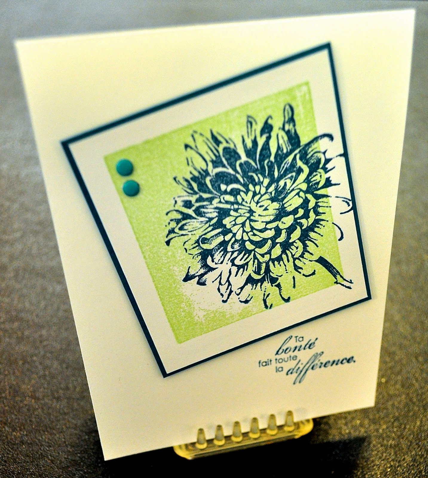
In my last post, I talked about backgrounds to help ground an image or to add color. One of the simplest ways to do this is to use your clear stamp blocks! You want a block that is just slightly smaller than the image you want to use, so that the image overhangs just a bit. This adds interest and importance to the image. Be sure your block is clean - alcohol will take care of fingerprints, but if you've gotten some adhesive on it (it happens, who knows how?!) try lighter fluid for easy removal.

Tap the clean block several times on your ink pad (in this case, Pistachio Pudding). The texture will look like tiny dots, due to the fact that the ink beads up on the acrylic. Stamp down on your paper as you would normally. Ta da! Nice clean edges and a block of color. If your block is large, you may need to put a silicone pad or something a little "squishy" beneath your paper before you stamp to prevent "whiteout" spots, although you may decide (as I did in the sample) that you like a point of light in your background. Clean as usual on the Stampin' Scrub.


Blooming with Kindness has loads of useful sentiments (in French or English!) and a very graphic flower, which translates well for this technique. Ink up the flower in Island Indigo, and angle it so that it overhangs your color block in a couple of places. Back with a very narrow margin of Island Indigo cardstock and add a couple of coordinating Candy Dots.


Inside, you'll see that I've reversed colors and used the flower in Pistachio Pudding for some background interest. I inked once, and stamped three times. The fainter the image becomes, the more your eye reads it as texture, rather than as image. I've repeated the sentiment from the front of the card in its English translation on the inside of card the front, and completed the thought with an additional sentiment in English. I'm a strong believer that we need to learn and appreciate other languages and cultures in this interconnected world.

Kathy


Wednesday, August 27, 2014

Work of Art meets Everything Eleanor


Have you ever tried to make something look effortless?! It's not as easy as it sounds, and that's exactly why Work of Art has become an instant favorite of mine. Watercoloring is such a wonderful look, but I've never been a watercolorist. Until now.

With this stamp set, you can make a background that anchors or adds color to just about anything else you want to put on the page. And what a great message to send those we love or wish to encourage: You are a fabulous work of art.

To replicate this card, you'll need Bermuda Bay, Hello Honey, and StazOn black inks (Hint: The small watercolor stamp is inked only once but stamped three times, from bottom to top). The swirl is from Everything Eleanor. A scrap of Bermuda Bay CS and the Elegant Butterfly punch add the third dimension, with a row of Basic Rhinestones for the body. Corners were rounded with the Project Life Corner Punch (p. 188). Pop up your "art piece" with dimensionals, and you're done! Another superspeedy layout for a card that fits so many occasions.

Kathy

Note: We made this in a demonstrator group meeting, but I believe the original concept came from SU! demo Sandi MacIver.


Monday, August 25, 2014

Silver Shimmer


Today's post is for all you "bling" lovers out there. Dawn Olchefske was inspired by a piece of jewelry to create this elegant card with the Petite Petals, Pansy, and Itty Bitty Accents punches. Of course, the gorgeous Million & One sentiment set (stamped here in Basic Gray) is a perfect match to the Silver Glimmer, Silver Foil and Whisper White papers.


The only other thing you need for this card is a whole bunch of Stampin Dimensionals and some Basic Pearls and Rhinestones.

Isn't "Clean & Simple" wonderful?!

Kathy


Wednesday, August 20, 2014

Just Sayin': Love ya!


I swapped with Monique for this card recently. What a fabulous way to use a sentiment set as the "art" on a card! And keeping it simple in black and white with a pop of red glimmer paper draws your eye right where you want it. We've got white StazOn, or you could emboss in white on black. The wee heart comes from the Owl Builder punch.

Kathy

Friday, May 30, 2014

Friendship Squares


 We've seen a number of posts recently featuring these little squares, much like what are called "Artist Trading Cards" (ATCs). I was thinking that when each person makes a set so that everyone gets one, they are like the friendship quilts my grandmother used to make, so I decided to call them "Friendship Squares". These measure 2.75" square, and are easily coordinated by selecting a series of Designer Series Paper (DSP) and a theme such as flowers, a season, a holiday, etc. Our demonstrator group decided to do a swap in May, and I've grouped some of the delightful designs above to illustrate how you might use them for a piece of home decor in a 12x12 frame (blanks could be filled in with additional designs or with a printed label such as "SU! Demos, Summertime, May 2014").

But what else could you do with them, I wondered? How about some cards? How about a simple approach that could be used with any set of colors or content??!

I came up with a set of quick and easy layouts for the squares using the coordinating colors specified by the DSP. Basically, you add a square from your stash and a sentiment that matches the occasion for which you need a card!

Here I've simply added a 3x4" base for the friendship square created with the Petite Petals punch and Secret Garden framelits.

In this example (folded from the hexagon punch), I grounded the Friendship Square with 2 punched squares for a little extra weight and pizzaz.      


Aren't these duckies delightful? You'll find them in the Baby's First framelits. I saw somewhere out in the wide world of the internet the idea of putting a Sharpie dot on one of our halfback pearls to make bulging eyes. The "waves" are popped up on dimensionals.

A simple notch with a square punch makes this paper ribbon strip, and a variety of flower punches from scraps balance the stamped nest from World of Dreams. Tiny pearls and a candy dot add extra dimension. In this case the art piece is up on dimensionals so that it casts a shadow.

This little fellow is a real hoot, isn't he? The creation of Monique, I simply centered him and added a big block sentiment from Bravo.

Using just a small portion of a larger stamp (in this case Postage Due) is a great way to find "new" images. I used the Perfect Pennants framelits to make my "racing flags", and Petite Pairs for the set of sentiments inside and out.

I forsee several versions of Friendship Squares in my future, made from different DSP with different themes. To find them all, click on the label "Friendship Squares" at the bottom of this post or in the sidebar.

Better yet, try your hand at it and leave a link in the comments section!

Kathy

Monday, July 23, 2012

A Good Layout Stands on its Head!


I promised to show you more tricks with our "Rule of Thirds" layout.


Compare this to the horizontal format from the last post. You can see that the balloon panel is the 2/3 piece, and the stripe is the 1/3 (back to using the World Spectacular DSP that was featured this month at the Lawrence club). The banner has narrowed slightly into a half inch strip.


And once again, if you would rather use stamps, the same proportions work - I've cut a couple of strips of paper with the Adorning Accents Edgelits, embossed them with the coordinating folders, and added two images from the My Friend set (French version, why not?!).

So many looks, so simple. What are you waiting for?

-Kathy

Friday, July 20, 2012

Stamp Club Olathe - July 2012

How would you design a card that can be quickly modified for any recipient, any occasion? That was the hostess' challenge for the Olathe club this month!


I decided to focus on a good strong layout, using DSP as my main element. Patio Party seemed a good choice, since it contains general "birthday" themes as well as some patterns and also some florals.


Did you spot the "Rule of Thirds"? That's always a great place to begin. One panel is roughly 1/3 the width of the card, the other 2/3. The banner strip ties them together, and the medallion provides a focal point. Aren't the new Apothecary Accents Framelits great shapes? The birthday sentiment is from Itty Bitty Banners.


See how simply substituting the floral DSP for the cakes makes immediately more feminine? I thought the butterflies made a nice combination with the flowers.

 
Wait, what happened?! It's doing tricks. A strong layout can easily be turned in another direction, as you can see.


If you prefer to use stamps instead of DSP, you can still get the same effect. Here I've collage-stamped an image from the set Papaya Collage, then added a banner strip (using another image from that set) and medallions as above.

In my next post, I'll show you how to turn this layout on its' head! 

Stay tuned,
Kathy

Wednesday, March 28, 2012

Clean & Simple Elegance


Want a quick yet elegant card for just about any one on any occasion?! How about this clean and simple beauty? It goes together in under 10 minutes.

Simply cut a strip of Whisper White card stock to 4.5" x 11" and score your fold line at 5.5". Fold and crease firmly with bone. Using black StazOn ink (instant dry, fine line, will not smear if you color over it with marker or Aqua Painter), stamp the foliage spray in the lower left corner of the card, leaving 1/4-1/2" margin to the edge. Add a word phrase (the hostess set Perfect Words has some great choices).

I've colored in all sets of three circles with a Real Red marker, and placed a basic pearl on the single circles of the design.

Finally, to pop the color and add dimension, I've attached three butterflies by folding in the middle and using Tombow. The dots and stripes on the butterflies add a sense of fun.Ta da! It doesn't get much simpler than that, but its very simplicity is what creates the elegance.

Give it a try! -Kathy


All supplies Stampin' Up!

Stamps: Creative Elements, Perfect Words (hostess)
Inks: black StazOn, Real Red Stampin' Write marker
Paper: Whisper White CS, 2010-2012 In-Color DSP Paper Stack (butterflies)
Accessories: Basic Pearls, Beautiful Wings sizzlit, Tombow Multipurpose glue

Wednesday, February 1, 2012

Furry Folk Valentine


Have you got your Valentines made yet? If not, let me encourage you to consider a non-traditional stamp set! Little animals have cuteness-factor built right in, and when paired with a heart-felt sentiment, they make the perfect image for a variety of occasions!

Furry Folk has lots of little images. If you stamped each individually, it would be pretty involved. The way to speed up production of multiple cards like this is to set up more than one image on your stamp block (another very nice option with the new clear stamps). I paired the two animals, and on another block the flower and ladybug. The sentiment was already a unit. I chose three hearts from the new Fashionable Hearts Embosslit Die, popped them up on dimensionals, and drew the strings on with a Stampin' Write marker.

The card measures 4.25" square, with the panel a 3.75" square (also popped up on dimensionals). I'll hand out most of these personally, but if I need to mail a few, they'll fit in our standard sized envelopes easily. -Kathy

Sunday, December 11, 2011

Stamp Club Olathe - December 2011


I'm really not trying to "cheat" by dating this post in December. I was working on it when I was struck down by a nasty infection, and slept away about 10 days of December in a medication-induced haze. I'm back in the saddle again, but I just wanted it in chronological order!

We were planning for some guests at our December meeting in Olathe, so I selected a supersimple thank you note and matching envelope project (thanks to Monique for bringing this simple layout to my attention recently). Aren't they striking? And the beauty of it is, that you can so easily make a gift of your thanks by packaging several blank cards together so that the recipient can keep the gift of gratitude going.

These cards measure 4.25" and can be mailed in our standard-sized envelope (decorated to match) or hand-delivered in an envelope made from coordinating DSP - watch for future posts!

-Kathy


Stamps: Daring Adventure and Thank You Kindly
Ink: Crumb Cake and Cherry Cobbler classic
Paper: Very Vanilla, Basic Black and Cherry Cobbler CS; Timeless Portrait DSP
Accessories: Basic Pearls

Sunday, June 19, 2011

Retirement Stamp-a-Stack 2011


Did you miss out on the chance to whip up some of these quickie cards? Each year as Stampin' Up! retires some sets to make room for new ones, Lori and Monique and I create a selection of cards that you can assemble in about 10 minutes each - and at the bargain price of just $1 each! Most of them can be modified to fit several occasions (based on your needs) simply by altering the sentiment stamp,

We have a few sets of materials remaining, so if you missed out on Saturday's session, give me a holler and we'll see if we can set up a time for you to make your very own. -Kathy

Monday, November 1, 2010

Karen's Cardinal Christmas


Here's a darling little 3x6"card from a fellow demo whose work has been featured here before, Karen Herrmann. Karen has used Cherry Cobbler as her base with texture from the Sanded background inked with Cherry Cobbler ink and Concord Crush from the Patterns Designer Series Paper Stack (In-Color) for interest on the top of the card. The Concord Crush Stitched Poly ribbon is also from the In-color family. A simple image from A Flower for All Seasons is watercolored with Cherry Cobbler, Always Artichoke and Concord Crush ink to pull it all together and create a focal point, and of course the sentiment is snitched from A Cardinal Christmas. The Scallop Rectangle Clearlits sizzlet (pg 211) was used to cut around the image after it was watercolored.

Wouldn't you just love to set this next to a great, big poinsettia in your house?! If I were feeling really generous, I might even send it to a friend... -Kathy

Monday, October 25, 2010

October 2010 Olathe Stamp Club


I wanted to show you the projects we did at our October meeting for the Olathe stamp club. It's always a challenge making one set of materials stretch to twelve stampers, so we're using the "divide and conquer" method: six people at each of two tables, with similar projects, although not exactly alike. I actually like this approach for several reasons; it not only cuts down on wait time, it also shows folks how small tweaks can personalize a design and it shows off more of our beautiful stamps and inks! We have lots of new stampers in this group, so I taught basic "collage stamping", a simple method of layering images to make your own "designer paper". We also added images to our sentiment blocks, to give them an extra layer of interest (but not too many, so they won't compete with the sentiment). Featured here are Autumn Splendor and French Foliage stamp sets. Technique Tip: When collage stamping, begin with your lightest color ink, then medium colors, and finally the strongest/darkest color last. Your eye can better determine how many times you need to stamp each one if you approach it this way. If you start with the darkest color, your lightest often won't show up by the time you get to it because all the area is covered with darker colors! Also, when collage stamping, rotate your stamp a quarter turn each time you touch down, to keep your pattern looking random and interesting. Be sure to stamp off the edge of the paper for a more natural look overall.

Grab a stamp set of your own and make some collage paper. It's a great way to relax! -Kathy

Monday, October 18, 2010

Deck the Halls with Joy

I fell for the Deck the Halls Christmas paper in the holiday mini catalog in one glance! Cutting into it was another matter... it's even more beautiful in real life! (Check out the one behind the card, won't that make a stunning background for a piece of photo wall art or a scrap book page?!) But I finally found my courage, and here's the result...

Because I wanted the focus to be on the paper, I chose a simple layout in "thirds". I applied the eyelet punch to the layered strips at the bottom, and tied a piece of Cherry Cobbler 1/2" Seam Binding around the line where the papers meet, leaving enough for a big, loopy bow. Let me just say, expect to see a LOT of this seam binding on projects this year! The color is yummy, and it performs SO well - it's soft enough to tie and hold a know, but retains its shape well. Finally, I stamped the sentiment from Welcome Christmas and cut it out, then backed it with Always Artichoke and cut it out again.
A couple of Stampin' Dimensionals on the back, and voila! The layout may be super simple, but the use of the DSP in multiple patterns and colors adds all the interest needed.

I thought it was a good reminder, as well: As I'm starting to plan for a busy holiday season, I first want to deck my halls with joy. -Kathy


Stamps-Welcome Christmas
Inks- Cherry Cobbler classic
Paper- Naturals Ivory CS; Deck the Halls DSP
Accessories- 1/2" Cherry Cobbler Seam Binding; Stampin' Dimensionals

Wednesday, August 25, 2010


Pear Pizzazz and Poppy Parade are two of the new in-colors for this year, here teamed with a strip of Newsprint DSP (you gotta love that stuff, it goes with everything!). The Poppy is such a strong color that I've used it sparingly so as not to compete with the sentiment. This is a quick layout that relies on the "Rule of Thirds" for balance and interest, making it a ten-minute card!

Try something similar with the paper and stamps in your stash, and let me know how it goes.

Kathy

Stamps: Friends Never Fade
Ink: Certainly Celery classic
Paper: Pear Pizzazz, Poppy Parade, and Naturals Ivory CS; Newsprint DSP
Accessories: Tombow Multi-purpose Adhesive, glue dot, black 1/8" taffeta ribbon

Wednesday, June 2, 2010

Goodbye, Apricot Appeal...


Well, this is it: Retirement month. Time to say goodbye to the "old" and make room for the new, time to get serious about stocking up on favorites that you just can't live without. :o)

One of mine is Apricot Appeal. Not so bold as orange, but warm and rich and versatile... Here's a card (designed by Deloris, assembled at a shoebox swap by me) that really lets the base color be a feature element. We used a stylus and a brass template to dry emboss the row of dots across the bottom section of the card. Sound complicated? It's super simple. You just "draw inside the lines" of the template (see page 188 in the 2009-2010 IB&C), then "scribble" across the rest of the shape to make the paper pop up. It's a lot like coloring with crayons, but even more forgiving!

Technique Tip- Determine which side of the paper you'll be using your stylus on (typically the back side where the images will be pushed down) and burnish over it with waxed paper. This makes your stylus glide easily over the paper. If you don't have a light box, use a window or French door as your work surface during the daytime so that you can see where to press into your template.

The focal point for the card is a small rectangle of whisper white with a stamped image. This was distressed, and a piece of 5/8" satin ribbon tied around it. Then we popped it up with some stamp scrap so it would cast a shadow and create dimension. Ta da! Simplicity is good. -Kathy


All supplies Stampin' Up!
Stamps: Flower Fancy

Ink: Apricot Appeal, Pretty in Pink classic
Paper:
Apricot Appeal, Whisper White CS

Accessories:
Priceless Classy Brass Template, stylus, waxed paper, 5/8" vanilla satin ribbon, stamp scrap

Wednesday, May 26, 2010

Spring Flower Monogram Card


Time for another super-quick layout idea! A set of these would be great thank you notes for a graduate or birthday person, or just as blank cards to have on hand for any occasion. And they're a snap to make.

You'll need an alphabet set, of course. One that reflects the tastes of the recipient. Pair it with some appropriate designer series paper, and pull a couple of colors out of the DSP to use as accent colors.

To make a perfectly positioned monogram, stamp first on your cardstock, then work from the open back of the punch to center the letter in the opening before you punch. You'll need 1 or 2 slightly larger punches for layering (in this case I used the 1 1/4" punch for the letter, then the 1 3/8" for the colored circle and the scallop circle punch for the final layer). To vary the look of the scallop circle punch a bit and make it coordinate more closely with the eyelet border punch, I simply used the 1/16" hand held punch to add a small hole in the center of each scallop. Once I had the entire medallion assembled, I popped it up on Stampin' Dimensionals so that it casts a shadow for interest. Note the thin line of yellow card stock between the DSP and the eyelet trim that echoes the yellow circle (in both size and color) of the medallion. Repeating elements in your work gives it a strong, finished look - as though everything belongs together!

Aahhh. Now that feels good. Kathy


All supplies Stampin' Up!


Stamps: Lovely Letters Alphabet
Ink: Old Olive classic
Paper: Naturals White, Crushed Curry, Melon Mambo CS; Lovely Flowers DSP (Level 3 Hostess)
Accessories: 1 1/4" circle, 1 3/8" circle, Scallop Circle, 1/16" hand held and Eyelet Border punches; 1/2" Rich Razzleberry Polka-Dot Grosgrain ribbon

Tuesday, December 22, 2009

A Cardinal Christmas Set Sampler - Post Card


Here's a quickie I designed for our "Christmas in July Stamp-a-Stack" just right for those of you who want to use the laser printer for your holiday message! Stampin' Up Whisper White and Very Vanilla will go through just about any printer, and if you have a way to feed straight through (without the rollers having to pull the paper around a roller) you can use the heavier weight naturals or colors for your project.

As you're setting up your message side, remember to leave room for an address! Once you've printed what you want, cut the card stock into quarters and stamp. This design uses the "ghost stamping" technique for a little added depth and interest (stamp fully inked, then stamp again without re-inking). I've also used the 1/4" punch for the red "berries" or faux brads... just attach with a dot of glue then add a dot of Crystal Effects on top and allow to dry.

No extra postage required!

Kathy


All Supplies Stampin' Up!

Paper: Naturals White CS (real red scraps)
Stamps: A Cardinal Christmas
Inks: Real Red, Always Artichoke classic
Accessories: 1/4" hand held punch, Crystal Effects

Wednesday, December 16, 2009

Winter Post Set Sampler- Contemporary Stag


Sometimes I like the simplicity of the "contemporary" look, where the negative space in the composition causes you to look immediately at the focal point of the card. I stamped just three times, layered, and did a row of piercings to add a little definition. Since it didn't bother me that the snowflake overlaps the stag, no masking was required.

Just the kind of card that's ideal for mass production!

Counting down the days with you,

Kathy


All supplies Stampin' Up! unless otherwise noted

Stamps: Winter Post, Warm Words
Ink: Real Red and Going Gray classic
Paper: Going Gray, Real Red and Whisper White CS
Accessories: Paper-Piercing Tool and mat
. Tombow Multi-Purpose Adhesive

Monday, December 14, 2009

Winter Post Set Sampler- Snowflake Card


Want a simple, wintry look? I stamped the Winter Post snowflake randomly in white craft ink onto Almost Amethyst CS. A large snowflake made with the Big Shot is attached with pop-up glue dots (now that I think of it, a clear sparkly brad from the Pretties Kit or one from the Ice Rhinestone brads would have been perfect in the snowflake center!), and the sentiment is silver-embossed in the bottom right corner. Ta da! The "Clean and Simple" look.

Tomorrow I'll show you a warm "contemporary country" look using a neutral palette.

See you then,
Kathy


All Supplies Stampin' Up! unless otherwise noted.

Stamps: Winter Post, Heard from the Heart (sentiment)
Ink: White craft, Versamark
Paper: Almost Amethyst, Whisper White CS
Accessories: Snowflake #2 Originals die, Silver embossing powder, pop-up glue dots