Showing posts with label Stamp Club. Show all posts

Monday, September 16, 2013

Stamp Club Olathe: September 2013


Re-Purposed Menu Binders

One of my customers likes to bring me things just to see if I can recycle them into something new. (Stay tuned, Lorena, there's another of your inspirations coming in the Christmas collection!) Her daughter was working at a restaurant when the company decided to update the menus, so I was issued the challenge: What could we make of these little 3-ring binders?


As you can see, there are a variety of page sizes, some tabs, plus inside and outside covers to consider. Since it's autumn and the tones of the menu are the colors of rich spices, I chose a palette of Very Vanilla, So Saffron, Cajun Craze, Old Olive, and Early Espresso. For the cover, I wanted to try out the watercolor technique using clear blocks shown here. We used the World Map stamp and glued the panel to the cover with the amazing Tombow Multipurpose Liquid Glue, smoothing from center to edges with the edge of a bone folder. Each person's cover came out beautifully different, but here's what mine looked like:


By selecting a color palette that echoed that of the original, I didn't feel that I had to wrap my new cover around edges and corners. Just covering the images seems to be enough.


Here's the inside front cover (the inside back will be similar, but likely with a pocket adhered at the bottom). I stamped this in Rose Red as an experiment... but by the next page I had changed to Cajun Craze, which tones much better with the original colors peeping out at the margins! Creative Elements comes together so nicely over an "anchor" of Old Olive stamped with a clear block. I chose a sentiment from Feel Goods, thinking it would be a great reminder no matter how one chose to use the book.


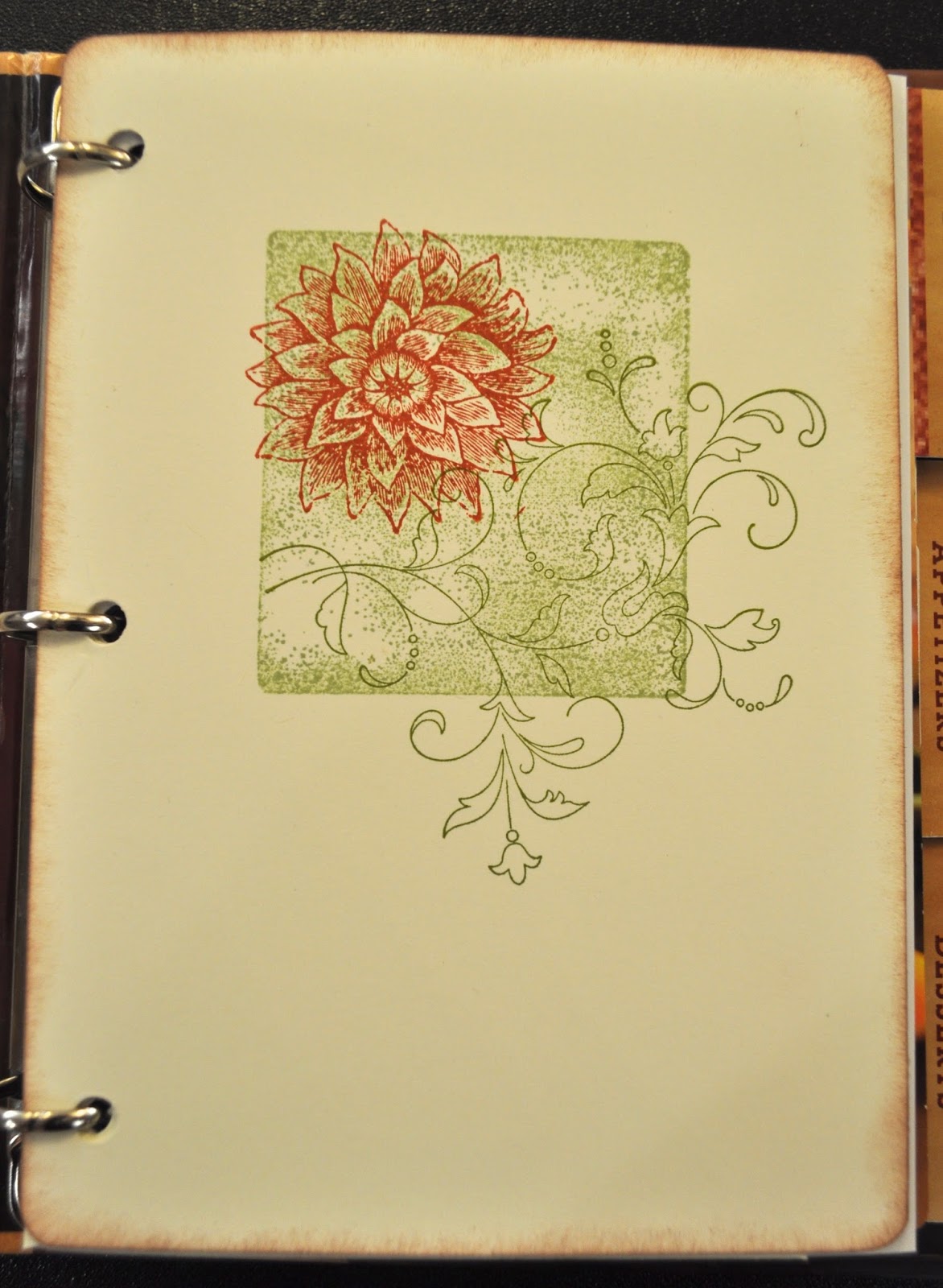
Divider pages are done simply, as above, with three quick stamps requiring no careful placement.


Pockets are easily added by simply punching holes in an envelope and inserting as needed.

Now, what could this project be used for?? Our list of ideas included...
     *heritage recipes
     *babysitter or housesitter notes
     *holiday planning (including names/addresses for mailing cards, shopping lists, and recipes)
     *a gratitude journal
     *advices pages from each attendee at a bridal or baby shower
     *collected wise words to live by/favorite sayings
     *art or idea journal
     *home dec records (paint chips, fabric swatches, etc. for each room in the house)
     *photo/prayer journal for each family member as a gift for an elderly friend/relative, especially someone in the early stages of Alzheimers

Hope this inspires you to repurpose something you might otherwise send to the landfill. It's a great way to keep that brain in "innovation gear"!  -Kathy

Wednesday, September 11, 2013

Stamp Club Lawrence: September 2013


 The hostess for September chose to work with the air dry clay available in the new Stampin' Up! Idea Book & Catalog. This product offers a fabulous way to make embellishments, ornaments, and so much more... I'll be posting several project ideas using this product, so stay tuned! (You can find them all by clicking on the label "Products- Air Dry Clay").


For this polka-spotted card, I tinted the clay with just a couple of drops of re-inker to make the white clay more like our vanilla. Before pressing the clay into the molds, I dry-brushed a little Dazzling Diamonds onto the silicone mold. Once dry, a drop or two of Tombow Multi-Purpose Glue holds the flower in place - and it cost just pennies to make!


Don't you like the perky paper bow? That's done with an oval punch! I really like the Modern Medley Designer Series Paper. The black-and-white patterns mix and match with just about everything. The stamp set is Gifts of Kindness - it has the prettiest little font style!

Kathy

Thursday, August 8, 2013

Stamp Club Olathe: August 2013


The hostess for the August meeting in Olathe thought it sounded like fun to make a pop-up card, so I looked around for a good one. I finally decided on the 3-tiered gift boxes card (a pictorial tutorial can be found here). Since SU! just had a sale on DSP I decided to feature that (and it saved time that we could put into card construction!).

There's just something about a pop-up card that makes you smile.

Kathy

Monday, September 3, 2012

Stamp Club Olathe: August 2012


Can you believe it's September already?! I have some catching up to do, but I'm determined to get back in the saddle here in blogland this month, despite a number of things working against me.

I taught an "emboss resist" card in Olathe for the August session. Above are two possible layouts using the same set of elements. It is such a thrill to watch the clear-embossed "invisible" image appear as if by magic when you start to sponge on color!


When you sponge, remember to work from lightest to darkest ink color. Here I've used So Saffron, Regal Rose and Raspberry Ripple.


Inside, the card repeats the image using Regal Rose for the background images and Raspberry Ripple for the simple sentiment. The card combines an image from the must-have Serene Silhouettes with sentiments from So Sorry.

Here's an alternative color scheme in blues, using Just Believe for the stamped images. It's actually a Whisper White background, but I was editing the photo in bad lighting and seem to have overcompensated in the wrong direction! Anyway, as you can see, this technique is ideal for silhouette stamps and adapts well to a variety of themes.

Thursday, May 24, 2012

Stamp Club Olathe - May 2012


The hostess for this month in the Olathe club wanted to recreate the card on p.116 of the 2011-12 IB&C using the two-step stampin' set Flower Fancy. However, she also wanted to incorporate the framelits labels. This is a great little mental exercise, and I think the results were simply charming. We gave some thought as well to gussying up the inside of the card. Version two, using hostess set Simply Soft, was created by the ladies at the second table (we split the group for practical reasons, less wait time and more elbow room!). We used a Stamp-a-ma-jig for this image, since it's smaller and more complex and we wanted to get the color on the allium inside the lines.

If you've never played with two-step stamps, give it a try! They're perfect for a casual look, and so quick and easy.  -Kathy

Wednesday, April 11, 2012

Stamp Club Lawrence - April 2012


Link
...and in Lawrence this month, stamp club members learned to use fabric on cards as a ribbon replacement and/or as a 3D embellishment!

Our hostess for the April club meeting is a quilter, so what a perfect choice. This is the flower featured in the Sale-a-bration brochure that so many of my customers requested to learn. If you'd like to give it a try, you can find it here.

Once again, I must thank a fellow demo from Topeka (you rock, Deloris!) for the basic layout of this card. Isn't it great what just a narrow strip of DSP can add to the overall look?! And the new edgelits dies and embossing folders are just perfect for adding visual and tactile interest.

Enjoy the April showers, Kathy

Wednesday, March 14, 2012

Stamp Club Olathe - March 2012


Over in Olathe, the hostess had a list as long as her arm of things she wanted to try out, but I narrowed it down to the new doily die and aqua painters. Once again, the card features the lovely Bordering on Romance stamp set, this time delicately tinted with classic inks. I use denatured alcohol in my aqua painters to retain the intensity of the colors. This set just reminds me of 1940s table linens, and I am having such fun with it!

Take a closer look at the doily. Do you see how the second example is a much bolder design? Same die, just punched out fewer of the little cuts. You can get so many different looks with this one die... AND it's the first large-scale Sizzlet die I've seen (this means it's thin and therefore easier to store). I think that making it black instead of the traditional white really gives the card "pop"!

Finally, note the bow. I'm usually a stingy ribbon user, finding all kinds of ways to save it and still get "the look". This time, however, I wanted "luxurious and feminine", so I've used a whole 18" of the 5/8" organza ribbon on my little homemade "perfect bow maker" and then given it additional dimension with the selective use of glue dots.

Sigh. Makes me happy to look at. So few things in life turn out exactly the way I picture them, but once in awhile I get there! -Kathy

Monday, March 12, 2012

Stamp Club Lawrence - March 2012


My stamp club hostess for March wanted to play with polyshrink (a.k.a. "Shrinkydink"). This is a really great material to use with stamps, and the possibilities are only as limited as your imagination! For our meeting, I chose to teach the group how to make patterned buttons, a technique my daughter tried out when we had a play date in the studio over Christmas vacation. Shrink plastic looks like overhead transparency sheets, but when you apply heat (using your embossing gun or the oven) it writhes and wiggles and eventually thickens and ends up at about 40% its original size. In this example, we stamped with craft ink on both sides (one blue, one green) to give added depth. Remember to punch any necessary holes before you apply heat!

The card also features the
build-a-bird punch, Bordering on Romance stamp set from the Occasions mini catalog, and a wonderful technique using blender pens and craft ink.

Isn't it amazing that we can use the same set of materials (stamps, ink, paper & accessories) and come up with so many different looks?! I love this job...
-Kathy

Monday, February 20, 2012

Stamp Club Olathe - February 2012


I think the laser cut cards in the spring mini catalog are fabulous, so I couldn't pass up the chance to use them for the base of our February club project in Olathe. I looked around in the top secret demonstrator idea files, and didn't find anything I wanted to replicate, so I decided to think through my approach on my own.

The laser cut is very intricate, which suggested a simple treatment on the rest of the card. Furthermore, it's so lovely, I didn't want to cover it up, which suggested vellum as the solution for the sentiment banner. I really wanted to feature the new pleated ribbon, and lastly, I wanted a design that could be used either as a Valentine, or for other occasions this spring (such as Mother's Day or simply "I love you").

Here's what I came up with, and the ladies seemed to like it. What are your ideas for these laser cut cards? -Kathy

Wednesday, February 15, 2012

Stamp Club Lawrence - February 2012


This month our hostess asked for a pop-up card. I was thrilled, as I think cards that "do tricks" are super popular with everyone (but especially guys and kids). So I set out to find one I liked, and came across this great double pop up on Brenda Quintana's blog.

We used Real Red craft ink (you know you can get "blank" full-sized craft pads which you can juice up with the re-inker of your choice, right?!) with the Valentine image from Sweet Centers on the front (along with some darling retired ribbon - check that Clearance Rack regularly!) to make the image really pop! Inside, we did our pop-up magic on some DSP from the In-Color Patterns Pack, with a bit of bling using silver Glimmer Paper (carried over from the Holiday Mini) and hand-colored Basic Rhinestones.

The little LED tea light used scraps from the card project, along with the 1 3/4" scallop circle punch and the scallop edge border punch.


Here's hoping you have as much fun with your cards and projects! -Kathy

Monday, January 23, 2012

Stamp Club Olathe - January 2012


We covered so much ground in both clubs this month! For these gals, I designed a card that featured one of the new edgelits dies and coordinating embossing folders, and we threw in a little two-tone stamping technique plus a few accent lines on the Stampin' Score! They echo the embossed lines from the folder nicely. I think this scheme of Basic Gray, Pink Pirouette and Wisteria Wonder is a nice alternative to the usual Valentine combo, don't you? The floral image is from a Sale-a-bration stamp set called Fresh Vintage, and you'll find the sentiment in Delightful Dozen.

But wait, there's more! In the next post I'll show you how we took this single element and used it on a scrap book page... -Kathy

Sunday, January 15, 2012

Stamp Club Lawrence - January 2012


One of the scrumptious new products in the Occasions Mini Catalog is a pack of laser cut cards in two designs (the other is a heart). They come with Blushing Bride envelopes. After seeing a sample on Mary Brown's blog (her banner featured four letters, requiring the sacrifice of an additional card!) I came up with this modification, which I taught at the Lawrence club this month. Let's see: JOY, HUG, LUV, YOU, the recipients MONOGRAM... think of any other appropriate 3-letter words that might work?!

We also used the tip from Patty Bennett about coloring your
basic pearls or rhinestones with Sharpies to make them any color you want!

I can hardly wait for February, when I'll be using the heart version of the Designer Cuts cards with the Olathe ladies. -Kathy


Sunday, December 11, 2011

Stamp Club Olathe - December 2011


I'm really not trying to "cheat" by dating this post in December. I was working on it when I was struck down by a nasty infection, and slept away about 10 days of December in a medication-induced haze. I'm back in the saddle again, but I just wanted it in chronological order!

We were planning for some guests at our December meeting in Olathe, so I selected a supersimple thank you note and matching envelope project (thanks to Monique for bringing this simple layout to my attention recently). Aren't they striking? And the beauty of it is, that you can so easily make a gift of your thanks by packaging several blank cards together so that the recipient can keep the gift of gratitude going.

These cards measure 4.25" and can be mailed in our standard-sized envelope (decorated to match) or hand-delivered in an envelope made from coordinating DSP - watch for future posts!

-Kathy


Stamps: Daring Adventure and Thank You Kindly
Ink: Crumb Cake and Cherry Cobbler classic
Paper: Very Vanilla, Basic Black and Cherry Cobbler CS; Timeless Portrait DSP
Accessories: Basic Pearls

Monday, December 5, 2011

Stamp Club Lawrence - December 2011


This is such a creative use of Pocket Silhouettes! And of course I always like the fresh look of a "clean & simple" approach. I CASEd and tweaked from something I saw on Joanne Friend's post on our demonstrator web site. The sentiment from Welcome Christmas was perfect, suggesting a medallion with a single, simple impression. Cherry Cobbler has become my favorite color this year, but even if that weren't so a simple knot of the scallop dots ribbon gives the composition "pop".

I hope you can find simple solutions to your many tasks in the coming days. -Kathy

Sunday, November 27, 2011

Festival of Trees 2011 - Folded German Bells


I know you've been wondering what our folded German bell ornaments would look like. I finally finished them last night as I was working on our Festival of Trees Entry, so here's a close-up, all painted and accented with ivy and berries. Let this be a lesson to you skeptics who thought yours wouldn't look good...! They were the perfect contrast in shape and size to the petal cones we made first.

Apologies to the Olathe gals, I managed to forget the materials we needed so they didn't make bells. However, you can find the instructions at http://www.allthingspaper.net/2009/12/folded-german-bell-tutorial.html and make your own! We used 6x6" squares of DSP, which I then spray painted a pale green. -Kathy

Friday, October 21, 2011

Festival of Trees 2011- Petal Cones


Each year Lawrence hosts the Festival of Trees, the proceeds of which benefit a local shelter. The Lawrence and Olathe stamp clubs are working to help me create a tree for this event which will then be auctioned to raise funds.

Our first project uses the Petal Cone Die. It's cut from Baja Breeze CS on the Big Shot and then rolled with a vintage wheel for visual texture, then we've added a holiday wish to the flap and sponged the edges. Gardener's twine "dresses it down" to coordinate with the woodsy feel of the entry (each entry has to have a name and a theme).

My sister developed a unique potpourri of local "gatherings" to fill the little organza bundles (she has promised to share the recipe in a future post, so stay tuned!). They smell simply wonderful! As I began to hang them on the tree, I realized there was another obvious use for these beauties: they would be perfect to hang on the posts or backs of chairs, or on doorknobs, or from lamps either as home decor or as a little gift for guests to take along as a memento of tea or dinner at your house.

We'll be making another festival entry project next month, and I'll post viewing times and locations so you can see the finished tree! -Kathy


All Supplies Stampin' Up'! Unless Otherwise Stated

Stamps-Very Vintage (jumbo wheel), Delightful Dozen (sentiment)
Inks- Soft Suede and Crumb Cake classic, Creamy Caramel cartridge (retired)
Paper- Baja Breeze CS
Accessories-Big Shot, Petal Cone die, jumbo stampin' around handle, Sticky Strip, 1/8" handheld punch, Gardener's Twine (Target dollar bins), Organza Scallop Circles (Dollar Tree)

Thursday, October 20, 2011

Stamp Club Olathe - October 2011


Our topic for club this month was a technique I call "Foreground/Background". It's a way to get a whole new look from your stamps, adding dimension without a lot of layers.

The concept works by understanding the way our brains interpret what our eyes see. Things in the distance/background are typically softer, less detailed, faded in color, and smaller; conversely, things in the foreground are crisp, full of detail, brighter, and larger. You can recreate these contrasts by varying your supplies and, in this case, using only part of your stamped image in the "background" to create "smaller" elements, as I've done here using the large pine tree from the set Lovely as a Tree.

You're also seeing "Faux Snow", a mixture of white embossing powder and Dazzling Diamonds applied over Tombow glue for sparkle and dimension. A little touch of Cherry Cobbler in the ink and ribbon gives it "pop". The sentiment is from Delightful Dozen.

Next time you take a walk, pay attention to the differences in how you see what's close at hand, and what is distant. You'll gain a new appreciation for the beauty that surrounds us! -Kathy

Tuesday, September 13, 2011

Olathe Stamp Club - September 2011


The gals in Olathe were fascinated by the idea of adding movement to stamped images, so we looked at two ways of doing this for our September project. One method involves touching down and then dragging the stamp; the other relies on a series of images stamped without re-inking. It's not quite as easy as it looks, but it sure is fun playing around with these effects!

By now there are numerous examples of the faux brad technique on the blog, but this time I added a stamped pattern before I punched them out and coated them with Crystal Effects. A tweak here and there keeps the work fresh, don't you think?!

And for those of you paper savers, note that on the second example I have used a double row of 1/4" strips of cardstock to echo the stripes so often found on team uniforms. I just happen to have soccer-crazy nephews who have birthdays every year... -Kathy


Thursday, August 25, 2011

Olathe Stamp Club - August 2011


I promised the girls in Olathe that I'd tell them the secret to instant weight loss. They got really excited - especially when they each mastered it for themselves in the space of an hour! We worked with sponges and layering and drop shadows using markers and multiple colors on solid stamps and masks. The really great thing is that these techniques can be applied equally to card-making and scrap booking, and use only basic tools & supplies that almost everyone has in their arsenal.

Just think how much less cards and scrap book pages would weigh if they could be completed with a single layer of paper - without giving up visual interest!
-Kathy

Monday, August 1, 2011

Lawrence Stamp Club - August 2011


I was excited when the hostess for club this month requested we use a letterpress plate, since I just hadn't got round to trying them out yet (although I have used some of the texture plates in a similar manner). The project I designed uses the new Fancy Fan design, which I inked in white craft before printing onto Calypso Coral. These plates emboss slightly while transferring the ink to the paper. It's just like helping my dad on the little printing press he used to use for engraved invitations!

Atop some Little Leaves sizzlet shapes in Certainly Celery is a collection of soft punched and "peeled" flower clusters on the right, accented with Basic Pearls. The sentiment is from Word Play, with a card base in Poppy Parade.

Enjoy what blooms remain in you garden this month. -Kathy