Wednesday, October 27, 2010

Last-Minute Party Plans


It happens every year. Someone in my sphere (usually a daughter) decides they want to have a Halloween party. I find myself scrabbling for suitable, seasonal decorations. This year, I have a secret weapon in my arsenal: SU! Decor Elements! The mini catalog has some dandy bats and spiders and other "Spooky Things", ten images for $14.95. I ordered a sheet and then realized I had this empty gallon can, great for popcorn or apples or a candy corn and peanut mix with a scoop... In less than five minutes, I had an eye-catching and original table element (I did it as a demo for the Olathe stamp club ladies). AND, I have nine images left to use on other things, from windows to mirrors to cabinet doors and walls. I can even add them to a platter or glass candle holder. They come right off with the sticky sheets you use to apply them.

Hope you've got a few tricks up your sleeve for treats,
Kathy

Monday, October 25, 2010

October 2010 Olathe Stamp Club


I wanted to show you the projects we did at our October meeting for the Olathe stamp club. It's always a challenge making one set of materials stretch to twelve stampers, so we're using the "divide and conquer" method: six people at each of two tables, with similar projects, although not exactly alike. I actually like this approach for several reasons; it not only cuts down on wait time, it also shows folks how small tweaks can personalize a design and it shows off more of our beautiful stamps and inks! We have lots of new stampers in this group, so I taught basic "collage stamping", a simple method of layering images to make your own "designer paper". We also added images to our sentiment blocks, to give them an extra layer of interest (but not too many, so they won't compete with the sentiment). Featured here are Autumn Splendor and French Foliage stamp sets. Technique Tip: When collage stamping, begin with your lightest color ink, then medium colors, and finally the strongest/darkest color last. Your eye can better determine how many times you need to stamp each one if you approach it this way. If you start with the darkest color, your lightest often won't show up by the time you get to it because all the area is covered with darker colors! Also, when collage stamping, rotate your stamp a quarter turn each time you touch down, to keep your pattern looking random and interesting. Be sure to stamp off the edge of the paper for a more natural look overall.

Grab a stamp set of your own and make some collage paper. It's a great way to relax! -Kathy

Friday, October 22, 2010

New Twist on Ribbon


This card started with the ribbon. I absolutely love-Love-LOVE this wide striped grosgrain because it's such a strong partner anywhere you use it. I wanted to feature it in a way I hadn't seen before, so I was messing around and I came up with this... and of course, the ribbon* set the color scheme for the card, then I added some of that wonderful old-fashioned "Newsprint" DSP, and then I had to repeat the red and black to tie it all together, and I was thinking about favorite Christmas movies and tunes (White Christmas with Bing Crosby and Danny Kaye. The scene where those two are impersonating a pair of sisters is so funny even they have a hard time getting through it!)... and there it was. You could easily stamp a sentiment, punch it out, and pop it up on some dimensionals to tack onto the upper left corner of the skater square if you wished.

*Hindsight is 20/20: If making it again, I would tuck the raw edge of the ribbon at the top of the card under the panel of DSP to conceal it, rather than pulling it up and over to the back of the card, where it shows... -Kathy


Stamps-
Winter Post

Ink-
Real Red classic

Paper-
Real Red and Naturals Ivory CS; Newsprint DSP

Accessories-
Photo Corner punch; 1/8" black taffeta & 1 1/4" Real Red Striped grosgrain ribbon
; Tombow Multi-Purpose adhesive

Wednesday, October 20, 2010

Twilight Snow


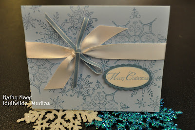
Although I stamped this card, it was designed for a swap by fellow demo Lisa, whose work I've showcased before. It's one of those beautifully simple cards that would be perfect for mass production! Just one color of ink, collage stamping for carefree placement, and a unique twist by simply tying the narrow blue ribbon on top of the white satin ribbon. The sentiment requires a quick stamp and two punches, and ta da! Ready to mail! -Kathy

P.S. All supplies Stampin' Up!, of course!

Monday, October 18, 2010

Deck the Halls with Joy

I fell for the Deck the Halls Christmas paper in the holiday mini catalog in one glance! Cutting into it was another matter... it's even more beautiful in real life! (Check out the one behind the card, won't that make a stunning background for a piece of photo wall art or a scrap book page?!) But I finally found my courage, and here's the result...

Because I wanted the focus to be on the paper, I chose a simple layout in "thirds". I applied the eyelet punch to the layered strips at the bottom, and tied a piece of Cherry Cobbler 1/2" Seam Binding around the line where the papers meet, leaving enough for a big, loopy bow. Let me just say, expect to see a LOT of this seam binding on projects this year! The color is yummy, and it performs SO well - it's soft enough to tie and hold a know, but retains its shape well. Finally, I stamped the sentiment from Welcome Christmas and cut it out, then backed it with Always Artichoke and cut it out again.
A couple of Stampin' Dimensionals on the back, and voila! The layout may be super simple, but the use of the DSP in multiple patterns and colors adds all the interest needed.

I thought it was a good reminder, as well: As I'm starting to plan for a busy holiday season, I first want to deck my halls with joy. -Kathy


Stamps-Welcome Christmas
Inks- Cherry Cobbler classic
Paper- Naturals Ivory CS; Deck the Halls DSP
Accessories- 1/2" Cherry Cobbler Seam Binding; Stampin' Dimensionals

Wednesday, October 13, 2010

Coffee Lovers Card


In an activity for demonstrators recently, Monique and Lori each got to choose a favorite stamp set that the rest of us would use to design a card. You've seen the one I did for Monique (check out the post on 9/13/10). Here is Lori's choice, using the set Morning Cup. Too bad I didn't have any "Early Espresso" paper at the time - how perfect would that have been?!

I stamped the images onto DSP from the Woodland Walk collection, because it reminded me of coffee beans. I cut these out with scissors and put Stampin' Dimensionals on the back. I then punched some 1 1/4" squares and used the corner rounder on two of these. After that it was a matter of simple layering to give "weight" to my images. Finally, I put the sentiment (with a cup just overlapping the end - gotta love these clear stamps!) onto a strip of Crumb Cake and backed it with Chocolate Chip, using the square punch again to make a perfect notch in the ends of the banner pieces. As I was sticking the banner in place, I tucked a piece of stamp scrap foam beneath it to make it "pooch".

On the inside of the card I created a medallion effect from some scraps of DSP, Chocolate Chip and Crumb Cake, then centered an Antique Brad on the layered squares before I glued them down. The sentiment and image seemed to go together so... ta da! Project finished. Could you guess I'm not a coffee drinker? -Kathy

Stamps- Morning Cup, Afterthoughts (Hostess)
Ink- Chocolate Chip classic
Paper- Naturals Vanilla, Crumb Cake, Chocolate Chip CS; Woodland Walk DSP
Accessories- 1 1/4" square and corner rounder punches; Antique Brads; Stampin' Dimensionals; Tombow Multi-Purpose Adhesive

Monday, October 11, 2010

Welcome, Olathe Stamp Club!


set

I want to take this opportunity to welcome the ladies of the newly formed Olathe Stamp Club to our blog - and our whirlwind of activities! Last month, several of the ladies who have been traveling to Lawrence for monthly club meetings held a workshop in their own neighborhood, and enough ladies expressed interest that we decided to form a club there. Hooray! We'll get together at 7:00pm on the first Wednesday of the month.

Here are the projects we did at the first workshop. These gals were interested in the Big Shot, so I developed an inking technique that I think calls to mind an antique tin ceiling panel (that was my intention, anyway!). And don't forget to decorate the inside of your card - it's important, too!

Enjoy this quiet autumn day - it's a nice break from all that perfect, sunny weather! -Kathy

Wednesday, October 6, 2010

October 2010 Stamp Club


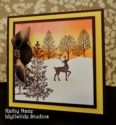
Our hostess for stamp club this month requested to learn the approach to creating landscapes using stamps which I most often associate with demonstrator Michelle Zindorf. Her results are genuinely unique among stampers. I designed two options using the same basic steps (both feature one of the best things about winter - the sunset sky against a tracery of stark branches), and I've included photos of a 3rd idea for "switching it up" into a Christmas card. Note that both examples use stamps from Christmas sets (Winter Post and Welcome Christmas) in a more general "seasonal" way. I always look for sets that have this sort of flexibility. And of course, Lovely as a Tree works for just about any subject you care to name! It's one of my top two recommendations for beginners in the entire Idea Book & Catalog. As you can see, silhouette stamps work best for this technique, so pull yours out and see what you can do! -Kathy

Monday, October 4, 2010

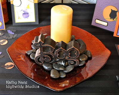
Haunting the Studio


The seasons are changing, and that's a great excuse for collecting favorite things together and creating a seasonal grouping! The fun thing about it is, you don't have to go out and buy it all - just look around your house for things in the colors you want to emphasize, or things that fit the theme. In these photos, you'll see a paint can and discarded t-shirt recycled into a mummy treat container; boots and socks suggesting traditional characters of the upcoming holiday (I just realized, I should have added my little hearth broom!); some vintage file boxes from the days when my dad had a store downtown; shutters found on the curb, to which hinges were added so that I'd have a room divider/background screen; and of course, cards and treat container ideas for my stamping friends. So many of these things can be reconfigured for Thanksgiving (plate, candle, stones, file boxes, wire pumpkin, shutters) - I love it when I can feel ahead of the game for even a moment! And when you rearrange your things, create a little vignette like this as a focal point, it makes the familiar feel fresh and new and gives a shot of energy to you and your home. Go and play! -Kathy