Friday, December 31, 2010
December 2010 Olathe Stamp Club
I love teaching. I always learn so much as I'm preparing projects for others, and there's nothing that makes me feel alive like learning something new!
I'd been hearing about "easel cards" for awhile, so I decided to teach it in order to learn it. There are two ways to construct an easel card; in one method you use a single strip of paper, and in the other, the front piece attaches separately (this version gives you the option of slightly larger cards). They lay flat for mailing, then prop themselves up for viewing like an artist's easel (see second photo).
The first sample I created features a photograph on the front panel, in honor of my mother-in-law, who has been in the hospital since before Thanksgiving. I wanted to create something for her bedside table that would bring to mind a fond memory and create a sense of hope. The second sample is a simple Christmas card. Don't the polka dots create a fun feeling of snowfall?! And I love the way that combining stamp sets allowed us to make the inside seem like a "close-up" of the card cover. -Kathy
December 2010 Lawrence Stamp Club
Time to do some catching up! Here's a quick view of the project the Lawrence "First Monday" stamp club made in December. It's a gift card folio made using crumb cake envelopes and that fabulous Victorian-looking DSP "Deck the Halls". You can make it in several different ways, to accommodate gift cards, photos, notes, drink packets, even small gifts that you want to seal into an envelope for safe-keeping. Easily modified for a variety of seasons and occasions! -Kathy
Family Portraits
Monday, December 13, 2010
Saving Paper
Tomorrow we will bury my father. We lost my father-in-law at the end of October, and my mother-in-law is recovering from an operation that will result in more big changes in her life. My Christmas tree is still naked, no gifts are bought, and I haven't posted for you in ages. But I have been spending time with family and with memories, and that has been rich in blessings. So I wanted to share a little story I wrote back in 1994 as another way of looking at this time of year, and at how the smallest things can make the biggest impression on us and form memories we cherish for a lifetime. Blessings to you, Kathy
*********
“To Mary, From Lona” read the careful copperplate script beneath the brittle yellow cellophane that must have come from the first roll of tape ever sold at the Halfway hardware store. The impossible pink-and-silver-scrolled Christmas wrap had been bequeathed to me from my grandmother’s careful hoard of color. Hers was a life in which many precious things were carefully hoarded: color, beauty, smiles, praise, approval.
It was a hot summer’s day, they say, a hundred-and-one in the shade where Grandfather had gone to rest from making hay. One minute he was drinking cool limey water from the tin dipper by the well; the next, a massive heart attack left Grandmother, at age 46 and without a resume, to make a living on the rocky red clay hills of an Ozark farm. Is it surprising, then, that beauty, even in the form of a creased sheet of wrapping paper, was deemed worthy of more than the burn pile?
My mother’s family, too, were “savers”. These shared histories of hardship merged into a yearly ritual of wrapping at my parents’ home. Each December as the 25th approached, we kids would pull out the cardboard tubes on which were rolled the memories of Christmases past. One by one we would peel them off, carefully ironing, trimming, removing tape. Tiny scraps and old greeting cards were fashioned into name tags; we rummaged in the bow-box for unsquished specimens of appealing hue, sometimes resorting to yarn, paper, tiny bells, or cones to decorate our packages.
I remember particularly a gift that I wrapped for my older sister, whose elegance and savoir-faire seems still just beyond my grasp. The thin colored paper sported medallions of greeny-yellow partridges in pear bushes on an unlikely blue background with hot pink worked into the scheme somewhere. How to accent such a breathtaking design? I painstakingly cut out one oval partridge, centered it on the package, and puffed it with cotton balls, sealing the edges with ‘Elmer’s glue. After the better part of an hour, I had finally worked out most of the ripples and gluey gray fingerprints. Time and invention were an important part of my gift, and I did not begrudge them.
When the remnants got too small to cover anything but the much-used white “jewelry boxes”, my brother and I would badger Mother into taking us to Gibson’s or Super-X for a new roll: 25, 50, maybe even 100 smooth, glossy feet of tapeless, creaseless, inky glory! In honor of NEW PAPER, we would select boxes just a little too big for our gifts, or use the old paper to wrap a series of boxes like nesting dolls, each just a little larger than the last, until we had no choice but to use the new paper – since none of the “savings” were large enough.
The opening of gifts, too, followed a distinct ritual. After “Santa’s helpers” had delivered to each person his or her allotment of mysterious shapes, we took turns opening them. My little brother usually ripped his; I pulled mine off the ends of the package whole, unless it was taped to the box – in which case, I ripped it; Mother and the older kids peeled away the tape with moderate care and an eye to reusing the paper. But it was Dad who made an art form out of the opening. He would fish in his pants for the ever-present pocket knife, newly sharpened for the occasion. Slowly he would select a blade and ease it open with his work-blunted thumbnail; slowly he would insert the thin silver blade into the wrapped seam until it reached the tape – snick, snick, snick; slowly he would rotate the package onto each plane to be sure that all taped joints had been summarily dispatched. The paper seemed to float away from the object at just the instant when the mingled anticipation and frustration levels of the giver had reached critical mass, and all without adding a single new crease to the paper, which would of course be saved for next year.
Our legacy has taken root differently in my brothers, my sister, and me. I now wrap my gifts in simple brown paper in rebellion against the increasing commercialization of a miracle. My sister chooses tasteful wraps in gentle soy ink colors made from post-consumer excesses. My older brother purchases humorous holiday wrap for $2.69/roll at the Discount City, having analyzed the cost/benefit ratio of hoarding. But my “little” brother still rips his wraps, secretly confiding to me his terror of ever again having to press and trim wrapping paper!
But there is a common thread in our separate wrapping rituals: It is the gift of story and fond memory that add beauty and color to our lives.
Perhaps one day I’ll ask Grandmother what was actually in that pink-and-silver-scrolled paper that made its way through the years to me.
Thursday, December 9, 2010
Monday, November 22, 2010
Candy Cane Christmas
I owe thanks to two fellow demos for this post: The card was designed by Kirstin Randazzo, the coaster by Lisa Cool. I thought they made a perfect pair!
To make the card, we embossed a standard-sized Baja Breeze base with the Northern Flurry folder, then grouped a series of assorted size circle punches (from the Candy Cane Christmas DSP) and a bird stamped with the Punch Potpourri hostess set. Several of the circles are popped up on dimensionals for interest.
The coasters are a cinch to make! Can't you imagine a set of four using those coordinating fabrics? We just placed a layer of Candy Cane Christmas fabric, a layer of quilt batting, and another layer of fabric together on the Scallop Square die, and ran it through the Big Shot all at the same time! Just 4-5 stitches (like a tied quilt), a Big Designer Button and a snowflake cut from felt (the Northern Frost decorative strip die is perfect), and you're done.
Great gift idea for a neighbor or office mate, don't you think?! -Kathy
Thursday, November 11, 2010
Regionals Card Share
Card #1
Stamps
Day of Gratitude
Card Stock and Paper
Old Olive CS
Very Vanilla CS
(i added Early Espresso CS to mat the Saying)
Inks
Old Olive Classic Stampin' Pad
Early Espresso Classic Stampin' Pad
Accessories and Tools
Medium Very Vanilla envelope
Old Olive 5/8" grosgrain ribbon: 18"
Pearl basic jewels
Stampin' Dimensionals
Bone Folder
Decorative Label Punch
Paper Snips
Stampin' Sponges
Card #2
Stamps
Birthday Bakery -Hostess Set
Card Stock and Paper
Chocolate Chip CS
More Mustard CS
Whisper White CS
Inks
Chocolate Chip Classic Pad
Accessories and Tools
Stampin' Sponges
Watercolor Pencils
Word Window Punch
Modern Label Punch
Wednesday, November 10, 2010
Thankful Tag
When I saw this swap from friend and fellow demo Deloris Carroll, I immediately thought "What a great little thing to put with a Thanksgiving place setting!" I can imagine it atop the napkin along with a pen, or sticking out of a goblet (perhaps the pen above the plate, in that case). I always feel we spend too little time actually expressing thanks, and too much eating, on Thanksgiving. So how about a little something for folks to make notes on and take home as a book mark or lamp decoration that would carry the theme further?
Deloris made a base from chipboard (like the stuff that comes in the package with your DSP) using the Two Tags die, then covered one side in DSP (use your favorite in seasonal colors that match your table setting!). The bird is from the Punch Potpourri hostess set, and the 3D flower with the Floral Fusion die and a brad.
Have fun planning your own festive tale, Kathy
Friday, November 5, 2010
November 2010 Olathe Stamp Club
I read recently of a technique called "Stampin' Mist Resist". Of course I had to try it, and then I had to share it with my gals. It gives you that wonderful "wow factor", and the deep rich colors (Cherry Cobbler and Not Quite Navy) are just yummy! Don't be afraid to get inky, and don't expect it to perform identically each time - this is a "process" technique, with lots of room to play along the way.
Note the card base of River Rock. It's one of those "push me pull you" colors, changing its tone depending on the color you pair it with.
And finally, I was thinking about how to use the little thin strips (less than 1/4") that I often end up with, much like quilling strips. I tried curling one, and came up with this Seuss-like addition to the standard bow. Might not mail well, but imagine someone's place setting featuring a birthday card with dimension like this! And it couldn't be more economical... -Kathy
Wednesday, November 3, 2010
November 2010 Lawrence Stamp Club
Our hostess for November elected to make bookmarks, so we did two versions; one that goes over the corner of the page, and one that is presented on a card but comes off to use as a keepsake. Book marks are such a great way to add a personal touch to the gift of a book, and teachers and librarians can always use more if you're connected with a school! -Kathy
Monday, November 1, 2010
Karen's Cardinal Christmas
Here's a darling little 3x6"card from a fellow demo whose work has been featured here before, Karen Herrmann. Karen has used Cherry Cobbler as her base with texture from the Sanded background inked with Cherry Cobbler ink and Concord Crush from the Patterns Designer Series Paper Stack (In-Color) for interest on the top of the card. The Concord Crush Stitched Poly ribbon is also from the In-color family. A simple image from A Flower for All Seasons is watercolored with Cherry Cobbler, Always Artichoke and Concord Crush ink to pull it all together and create a focal point, and of course the sentiment is snitched from A Cardinal Christmas. The Scallop Rectangle Clearlits sizzlet (pg 211) was used to cut around the image after it was watercolored.
Wouldn't you just love to set this next to a great, big poinsettia in your house?! If I were feeling really generous, I might even send it to a friend... -Kathy
Wednesday, October 27, 2010
Last-Minute Party Plans
It happens every year. Someone in my sphere (usually a daughter) decides they want to have a Halloween party. I find myself scrabbling for suitable, seasonal decorations. This year, I have a secret weapon in my arsenal: SU! Decor Elements! The mini catalog has some dandy bats and spiders and other "Spooky Things", ten images for $14.95. I ordered a sheet and then realized I had this empty gallon can, great for popcorn or apples or a candy corn and peanut mix with a scoop... In less than five minutes, I had an eye-catching and original table element (I did it as a demo for the Olathe stamp club ladies). AND, I have nine images left to use on other things, from windows to mirrors to cabinet doors and walls. I can even add them to a platter or glass candle holder. They come right off with the sticky sheets you use to apply them.
Hope you've got a few tricks up your sleeve for treats, Kathy
Monday, October 25, 2010
October 2010 Olathe Stamp Club
I wanted to show you the projects we did at our October meeting for the Olathe stamp club. It's always a challenge making one set of materials stretch to twelve stampers, so we're using the "divide and conquer" method: six people at each of two tables, with similar projects, although not exactly alike. I actually like this approach for several reasons; it not only cuts down on wait time, it also shows folks how small tweaks can personalize a design and it shows off more of our beautiful stamps and inks! We have lots of new stampers in this group, so I taught basic "collage stamping", a simple method of layering images to make your own "designer paper". We also added images to our sentiment blocks, to give them an extra layer of interest (but not too many, so they won't compete with the sentiment). Featured here are Autumn Splendor and French Foliage stamp sets. Technique Tip: When collage stamping, begin with your lightest color ink, then medium colors, and finally the strongest/darkest color last. Your eye can better determine how many times you need to stamp each one if you approach it this way. If you start with the darkest color, your lightest often won't show up by the time you get to it because all the area is covered with darker colors! Also, when collage stamping, rotate your stamp a quarter turn each time you touch down, to keep your pattern looking random and interesting. Be sure to stamp off the edge of the paper for a more natural look overall.
Grab a stamp set of your own and make some collage paper. It's a great way to relax! -Kathy
Friday, October 22, 2010
New Twist on Ribbon
This card started with the ribbon. I absolutely love-Love-LOVE this wide striped grosgrain because it's such a strong partner anywhere you use it. I wanted to feature it in a way I hadn't seen before, so I was messing around and I came up with this... and of course, the ribbon* set the color scheme for the card, then I added some of that wonderful old-fashioned "Newsprint" DSP, and then I had to repeat the red and black to tie it all together, and I was thinking about favorite Christmas movies and tunes (White Christmas with Bing Crosby and Danny Kaye. The scene where those two are impersonating a pair of sisters is so funny even they have a hard time getting through it!)... and there it was. You could easily stamp a sentiment, punch it out, and pop it up on some dimensionals to tack onto the upper left corner of the skater square if you wished.
*Hindsight is 20/20: If making it again, I would tuck the raw edge of the ribbon at the top of the card under the panel of DSP to conceal it, rather than pulling it up and over to the back of the card, where it shows... -Kathy
Stamps- Winter Post
Ink- Real Red classic
Paper- Real Red and Naturals Ivory CS; Newsprint DSP
Accessories- Photo Corner punch; 1/8" black taffeta & 1 1/4" Real Red Striped grosgrain ribbon; Tombow Multi-Purpose adhesive
Wednesday, October 20, 2010
Twilight Snow
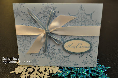
Although I stamped this card, it was designed for a swap by fellow demo Lisa, whose work I've showcased before. It's one of those beautifully simple cards that would be perfect for mass production! Just one color of ink, collage stamping for carefree placement, and a unique twist by simply tying the narrow blue ribbon on top of the white satin ribbon. The sentiment requires a quick stamp and two punches, and ta da! Ready to mail! -Kathy
P.S. All supplies Stampin' Up!, of course!
Monday, October 18, 2010
Deck the Halls with Joy
Because I wanted the focus to be on the paper, I chose a simple layout in "thirds". I applied the eyelet punch to the layered strips at the bottom, and tied a piece of Cherry Cobbler 1/2" Seam Binding around the line where the papers meet, leaving enough for a big, loopy bow. Let me just say, expect to see a LOT of this seam binding on projects this year! The color is yummy, and it performs SO well - it's soft enough to tie and hold a know, but retains its shape well. Finally, I stamped the sentiment from Welcome Christmas and cut it out, then backed it with Always Artichoke and cut it out again. A couple of Stampin' Dimensionals on the back, and voila! The layout may be super simple, but the use of the DSP in multiple patterns and colors adds all the interest needed.
I thought it was a good reminder, as well: As I'm starting to plan for a busy holiday season, I first want to deck my halls with joy. -Kathy
Stamps-Welcome Christmas
Inks- Cherry Cobbler classic
Paper- Naturals Ivory CS; Deck the Halls DSP
Accessories- 1/2" Cherry Cobbler Seam Binding; Stampin' Dimensionals
Wednesday, October 13, 2010
Coffee Lovers Card
In an activity for demonstrators recently, Monique and Lori each got to choose a favorite stamp set that the rest of us would use to design a card. You've seen the one I did for Monique (check out the post on 9/13/10). Here is Lori's choice, using the set Morning Cup. Too bad I didn't have any "Early Espresso" paper at the time - how perfect would that have been?!
I stamped the images onto DSP from the Woodland Walk collection, because it reminded me of coffee beans. I cut these out with scissors and put Stampin' Dimensionals on the back. I then punched some 1 1/4" squares and used the corner rounder on two of these. After that it was a matter of simple layering to give "weight" to my images. Finally, I put the sentiment (with a cup just overlapping the end - gotta love these clear stamps!) onto a strip of Crumb Cake and backed it with Chocolate Chip, using the square punch again to make a perfect notch in the ends of the banner pieces. As I was sticking the banner in place, I tucked a piece of stamp scrap foam beneath it to make it "pooch".
On the inside of the card I created a medallion effect from some scraps of DSP, Chocolate Chip and Crumb Cake, then centered an Antique Brad on the layered squares before I glued them down. The sentiment and image seemed to go together so... ta da! Project finished. Could you guess I'm not a coffee drinker? -Kathy
Stamps- Morning Cup, Afterthoughts (Hostess)
Ink- Chocolate Chip classic
Paper- Naturals Vanilla, Crumb Cake, Chocolate Chip CS; Woodland Walk DSP
Accessories- 1 1/4" square and corner rounder punches; Antique Brads; Stampin' Dimensionals; Tombow Multi-Purpose Adhesive
Monday, October 11, 2010
Welcome, Olathe Stamp Club!
set
I want to take this opportunity to welcome the ladies of the newly formed Olathe Stamp Club to our blog - and our whirlwind of activities! Last month, several of the ladies who have been traveling to Lawrence for monthly club meetings held a workshop in their own neighborhood, and enough ladies expressed interest that we decided to form a club there. Hooray! We'll get together at 7:00pm on the first Wednesday of the month.
Here are the projects we did at the first workshop. These gals were interested in the Big Shot, so I developed an inking technique that I think calls to mind an antique tin ceiling panel (that was my intention, anyway!). And don't forget to decorate the inside of your card - it's important, too!
Enjoy this quiet autumn day - it's a nice break from all that perfect, sunny weather! -Kathy
Wednesday, October 6, 2010
October 2010 Stamp Club
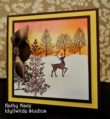
Our hostess for stamp club this month requested to learn the approach to creating landscapes using stamps which I most often associate with demonstrator Michelle Zindorf. Her results are genuinely unique among stampers. I designed two options using the same basic steps (both feature one of the best things about winter - the sunset sky against a tracery of stark branches), and I've included photos of a 3rd idea for "switching it up" into a Christmas card. Note that both examples use stamps from Christmas sets (Winter Post and Welcome Christmas) in a more general "seasonal" way. I always look for sets that have this sort of flexibility. And of course, Lovely as a Tree works for just about any subject you care to name! It's one of my top two recommendations for beginners in the entire Idea Book & Catalog. As you can see, silhouette stamps work best for this technique, so pull yours out and see what you can do! -Kathy
Monday, October 4, 2010
Haunting the Studio
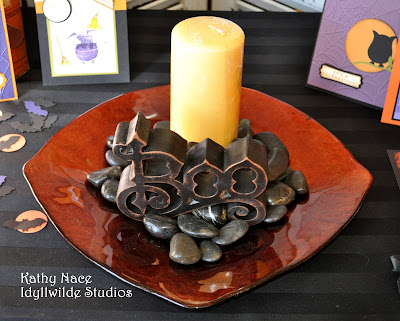
The seasons are changing, and that's a great excuse for collecting favorite things together and creating a seasonal grouping! The fun thing about it is, you don't have to go out and buy it all - just look around your house for things in the colors you want to emphasize, or things that fit the theme. In these photos, you'll see a paint can and discarded t-shirt recycled into a mummy treat container; boots and socks suggesting traditional characters of the upcoming holiday (I just realized, I should have added my little hearth broom!); some vintage file boxes from the days when my dad had a store downtown; shutters found on the curb, to which hinges were added so that I'd have a room divider/background screen; and of course, cards and treat container ideas for my stamping friends. So many of these things can be reconfigured for Thanksgiving (plate, candle, stones, file boxes, wire pumpkin, shutters) - I love it when I can feel ahead of the game for even a moment! And when you rearrange your things, create a little vignette like this as a focal point, it makes the familiar feel fresh and new and gives a shot of energy to you and your home. Go and play! -Kathy
Wednesday, September 29, 2010
Bird Cage Basics
Monday, September 27, 2010
Thank Ewe!
Ever notice how sometimes you just have to have or do something because every time you look at it, it makes you laugh? These guys do it for me!
They're part of a set called Pun Fun, and of course since sheep usually occur in flocks it's appropriate to stamp them multiple times. But how do you avoid inking the sentiment that's attached to the image? This can be very frustrating! Wait... here's an idea.
Technique Tip: Before mounting these stamps (and others like them), cut apart the image and the sentiment. Attach the image as usual, but mount the sentiment on the end of the block! By doing so you can use them either separately or together. If you're working with clear stamps, of course, you'll just store them and mount whatever combination you need for your project.
When stamping the sentiment, remember to stamp first and then work from the back of the punch to center the sentiment in the opening. Makes placement much simpler!
And finally, note how the scalloped edge on the inside panel echoes the fluffy sheep shape. Serendipity. -Kathy
Stamps: Pun Fun, Kind & Caring Thoughts
Ink: Basic Black, Pink Pirouette (marker)
Paper: Basic Black, Crumb Cake, Riding Hood Red and Whisper White CS
Accessories: Scallop Edge Border and Word Window punches, Beautiful Wings Embosslit die (Balloon punch - retired), Stampin' Dimensionals
Wednesday, September 22, 2010
Christmas is Coming...
I hate to be the one to tell you this, but it's time to get serious about those holiday gifts and greetings! Monique sneaked in a couple of ideas way back in July (did you catch them?!), just to light a spark, but we'll be posting from here on out with increasing frequency as we collect ideas to spark your creativity.
To ease you into the mode, I want to continue the recent theme of "switching up" a good design from one purpose to another. When I conceptualized this card, I was thinking of 1940s aprons and tablecloths, can you tell?! I began with pair of returning color favorites, Baja Breeze and Pink Pirouette. And then, because I just love it, I added the shimmery Presto Patterns DSP, cut with the Big Shot using our Top Note die. I stamped and "stamped off" several times on the pattern paper, then added additional color by sponging, pulling in a little olive.
Next I chose a sentiment and stamped repeatedly on the base for visual interest (and to reinforce the message), then glued down the DSP. Digging out a bunch of white scraps, I made the flowers. Those two-step stamps are such fun! And being me, I sat and reveled in cutting out every last one of them. My first grade teacher would be so proud! I also cut a few little leaves with the Big Shot to combine with the flowers. I grouped these in one corner, popping some of them up on dimensionals, and interspersed some leaves.
Finally, I stamped a sentiment to go opposite the flowers. In the first instance I gave it visual weight by gathering ribbon onto the back of the oval (which I edged in sticky strip), and attaching a red button. On the Christmas version, I simply used Riding Hood Red for the sentiment and the matting, since a strong color calls attention to itself and has "visual weight".
Now, I admit this card is not suitable for mass production, but it's a great idea for a grandma, aunt, or any special person who appreciates vintage linens. And the beauty of it is that as you're producing, you can make a couple for both your birthday and your holiday card stashes! Kathy
Stamps: Greenhouse Garden, Elements of Style, Grateful Greetings
Inks: Baja Breeze, Pink Pirouette, Riding Hood Red, Old Olive
Paper: Baja Breeze, Old Olive, Riding Hood Red, Whisper White CS; Presto Patterns DSP
Accessories: Little Leaves Sizzlet, Top Note die, Stampin' Dimensionals (vintage button and seam binding)
Tuesday, September 21, 2010
S'mores Kits
1 bag of Chocolate Chunks (you can also use chocolate chips but the chunks look like bars)
1 Box of Teddy Grahams (reg flavor)
1 Bag of Mini Marshmallows
I printed sentiment using the computer on Address labels.
Punches:
Wide Oval 2"x1 3/8"
Large Oval 1 3/4" x 5/8"
Small Oval1 3/8" x 5/8"
Card Stock
Chocolate Chip
Tempting Turquoise
Melon Mambo
Big Shot
With the Scallop Envelope Bigz die
Small Cellophane Bags
Daffodil Delight 1/8" Taffeta Ribbon
Monday, September 20, 2010
Family Heritage
See the cute little guy in the overalls front and center? That's my father-in-law, turning 90 on the 25th! This photo was taken in about 1925 near Dwight, Kansas, and how many stories they would find to tell in the coming years.
Once again, Mary Brown was the inspiration for this project. I began with a sheet of our amazing Presto Patterns specialty paper, then studied the photo to see what colors were hidden in the sepia tones. I decided yellows, browns, and pinks, so began sponging on thin layers, beginning with the lightest color. It was magic watching the design from the Presto Pattern sheet emerge! I worked back and forth, here and there, with a general idea where I wanted my photo, keeping in mind that in this case the "white space" that would rest the eye and make a contrast to the other techniques meant leaving the ink off.
When I thought I had enough color, I finalized the placement of the photo and used an x-acto to mark where the edges intersected with large swirls on the Presto Patterns paper. I removed the photo, and used the x-acto to cut around the printed pattern out so that I could slide the photo underneath. When I finished, I secured the photo.
Next, I stamped the floral spray from Elements of Style three times on Naturals Vanilla and watercolored it using Rose Red and Old Olive to represent the wild roses that grow along the stone fences in the area, built by a great-grandfather. I then cut out these rose sprays, cut them apart, and tucked them here and there on the page to add some detail and color.
Now, how to add text that I don't have stamps for? I used Word to create a file with the family name and and a few other details, turning the letters a dark brown that approximates Chocolate Chip. I then ran a sheet of vanilla CS through the printer and cut out around the elements I needed, popping them up on dimensionals so they would cast a shadow for interest. The only handwritten element is the "Circa 1925" on the little round Mini Vintage Tag, which hangs from a satin bow tinted pink here and there with marker and aqua painter. And voila!
I love the concept of framing a scrapbook page. You can display it for as long as you want on the wall, then tuck it into a protective scrap book and put up something new on your wall. Hope you've enjoyed this little trip down memory lane with me, Kathy
Stamps: Elements of Style
Ink: Barely Banana, Apricot Appeal, Pink Pirouette, Rose Red, Old Olive classic (* just retired); Pink Pirouette marker
Paper: Presto Patterns DSP, Naturals Vanilla, Very Vanilla
Accessories: aquapainter, 5/8" vanilla satin ribbon, Mini VintageTag, Styled Vanilla hardware (shadowbox frame from local clearance rack)
Thursday, September 16, 2010
Night Owl
This Card was the start of My Halloween. Just putting it together made me feel like getting all dressed up to go out and buy big bags of candy.
Simple, Simple Card to put together.
Stamp Set:
Afterthought - Hostess Set
Ink:
Soft Suede - Classic
Pumpkin Pie- Classic
Paper:
Perfect Plum - for the Web
Basic Black for the tag and card base
Old Olive for the branch
More Mustard for the Moon
Very Vanilla for the Tag
Accessories:
Owl Punch
Bird Punch
Spider Web Textured Impressions Folder
Big Shot
Stampin Sponges
Glue dots
Stampin' Dimensionals
Snail Adhesive